Jfree实现统计图
使用java实现各种数据统计图(柱形图,饼图,折线图)
最近在做数据挖掘的课程设计,需要将数据分析的结果很直观的展现给用户,这就要用到数据统计图,要实现这个功能就需要几个第三方包了:
1. jfreechart-1.0.13.jar
2. jcommon-1.0.16.jar
3. gnujaxp.jar
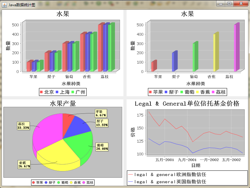
先来看一下,最终效果图:
主要是jfreechart-1.0.13.jar,但这三个包要齐全,我已经将所有与jfreechart有关的jar包与本文实例的工程(代码)一同压缩上传了,有兴趣的同学可以下载,
下载地址:http://download.csdn.net/detail/pzhtpf/4327700
接下来,我们一步步来实现本程序。
一,前期准备工作,也就把这三个第三方包添加进本文工程,添加过程特别简单,前面写过一篇博客,讲的是java如何读取Excel表格中的数据(有兴趣的同学可以看一看:http://blog.csdn.net/pzhtpf/article/details/7506135),也要添加第三方包,添加过程一模一样,这里我们在复习一遍:
1, 建,立java项目,在这个项目在建立一个新的文件夹lib;
2, 将上述三个jar包,复制到lib
3,然后右键点击这个java项目,选择Properties
4,在左侧列表里选中Java Build Path,右侧选中Libraries
5,点击Add JARs
6, 然后去选择这个项目中lib文件夹中的三个jar,点击确定
成功后,项目中会多一个文件夹为:Referenced Libraries
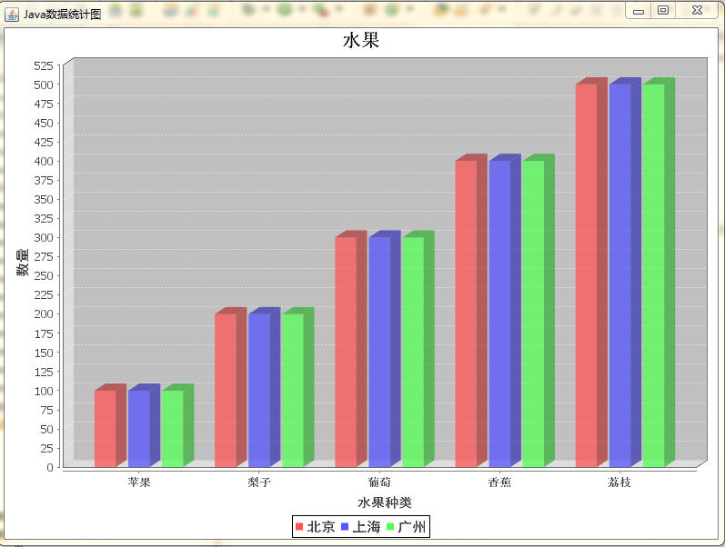
二, 实现柱形图的java代码:
|
1
2
3
4
5
6
7
8
9
10
11
12
13
14
15
16
17
18
19
20
21
22
23
24
25
26
27
28
29
30
31
32
33
34
35
36
37
38
39
40
41
42
43
44
45
46
47
48
49
50
51
52
53
54
55
56
57
58
59
|
import java.awt.Font;
import org.jfree.chart.ChartFactory;
import org.jfree.chart.ChartPanel;
import org.jfree.chart.JFreeChart;
import org.jfree.chart.axis.CategoryAxis;
import org.jfree.chart.axis.ValueAxis;
import org.jfree.chart.plot.CategoryPlot;
import org.jfree.chart.plot.PlotOrientation;
import org.jfree.data.category.CategoryDataset;
import org.jfree.data.category.DefaultCategoryDataset;
public class BarChart {
ChartPanel frame1;
public BarChart(){
CategoryDataset dataset = getDataSet();
JFreeChart chart = ChartFactory.createBarChart3D(
"水果" , // 图表标题
"水果种类" , // 目录轴的显示标签
"数量" , // 数值轴的显示标签
dataset, // 数据集
PlotOrientation.VERTICAL, // 图表方向:水平、垂直
true , // 是否显示图例(对于简单的柱状图必须是false)
false , // 是否生成工具
false // 是否生成URL链接
);
//从这里开始
CategoryPlot plot=chart.getCategoryPlot(); //获取图表区域对象
CategoryAxis domainAxis=plot.getDomainAxis(); //水平底部列表
domainAxis.setLabelFont( new Font( "黑体" ,Font.BOLD, 14 )); //水平底部标题
domainAxis.setTickLabelFont( new Font( "宋体" ,Font.BOLD, 12 )); //垂直标题
ValueAxis rangeAxis=plot.getRangeAxis(); //获取柱状
rangeAxis.setLabelFont( new Font( "黑体" ,Font.BOLD, 15 ));
chart.getLegend().setItemFont( new Font( "黑体" , Font.BOLD, 15 ));
chart.getTitle().setFont( new Font( "宋体" ,Font.BOLD, 20 )); //设置标题字体
//到这里结束,虽然代码有点多,但只为一个目的,解决汉字乱码问题
frame1= new ChartPanel(chart, true ); //这里也可以用chartFrame,可以直接生成一个独立的Frame
}
private static CategoryDataset getDataSet() {
DefaultCategoryDataset dataset = new DefaultCategoryDataset();
dataset.addValue( 100 , "北京" , "苹果" );
dataset.addValue( 100 , "上海" , "苹果" );
dataset.addValue( 100 , "广州" , "苹果" );
dataset.addValue( 200 , "北京" , "梨子" );
dataset.addValue( 200 , "上海" , "梨子" );
dataset.addValue( 200 , "广州" , "梨子" );
dataset.addValue( 300 , "北京" , "葡萄" );
dataset.addValue( 300 , "上海" , "葡萄" );
dataset.addValue( 300 , "广州" , "葡萄" );
dataset.addValue( 400 , "北京" , "香蕉" );
dataset.addValue( 400 , "上海" , "香蕉" );
dataset.addValue( 400 , "广州" , "香蕉" );
dataset.addValue( 500 , "北京" , "荔枝" );
dataset.addValue( 500 , "上海" , "荔枝" );
dataset.addValue( 500 , "广州" , "荔枝" );
return dataset;
}
public ChartPanel getChartPanel(){
return frame1;
}
}
|
效果图如下:
但我们把private static CategoryDataset getDataSet(){}方法中的数据变化一下后,又会形成另一种效果,比如说我们改成:
|
1
2
3
4
5
6
7
8
9
|
private static CategoryDataset getDataSet() {
DefaultCategoryDataset dataset = new DefaultCategoryDataset();
dataset.addValue( 100 , "苹果" , "苹果" );
dataset.addValue( 200 , "梨子" , "梨子" );
dataset.addValue( 300 , "葡萄" , "葡萄" );
dataset.addValue( 400 , "香蕉" , "香蕉" );
dataset.addValue( 500 , "荔枝" , "荔枝" );
return dataset;
}
|
效果图如下:
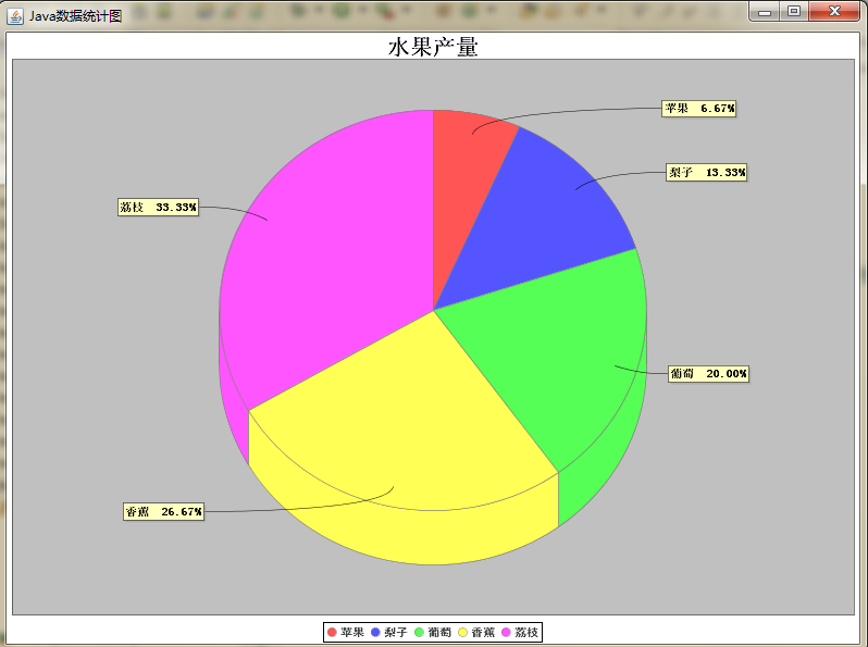
三 实现饼状图的java代码:
|
1
2
3
4
5
6
7
8
9
10
11
12
13
14
15
16
17
18
19
20
21
22
23
24
25
26
27
28
29
30
31
32
33
34
35
36
37
38
39
40
41
42
43
44
45
46
47
|
package com.njue.testJFreeChart;
import java.awt.Font;
import java.text.DecimalFormat;
import java.text.NumberFormat;
import javax.swing.JPanel;
import org.jfree.chart.ChartFactory;
import org.jfree.chart.ChartPanel;
import org.jfree.chart.JFreeChart;
import org.jfree.chart.labels.StandardPieSectionLabelGenerator;
import org.jfree.chart.plot.PiePlot;
import org.jfree.data.general.DefaultPieDataset;
public class PieChart {
ChartPanel frame1;
public PieChart(){
DefaultPieDataset data = getDataSet();
JFreeChart chart = ChartFactory.createPieChart3D( "水果产量" ,data, true , false , false );
//设置百分比
PiePlot pieplot = (PiePlot) chart.getPlot();
DecimalFormat df = new DecimalFormat( "0.00%" ); //获得一个DecimalFormat对象,主要是设置小数问题
NumberFormat nf = NumberFormat.getNumberInstance(); //获得一个NumberFormat对象
StandardPieSectionLabelGenerator sp1 = new StandardPieSectionLabelGenerator( "{0} {2}" , nf, df); //获得StandardPieSectionLabelGenerator对象
pieplot.setLabelGenerator(sp1); //设置饼图显示百分比
//没有数据的时候显示的内容
pieplot.setNoDataMessage( "无数据显示" );
pieplot.setCircular( false );
pieplot.setLabelGap( 0 .02D);
pieplot.setIgnoreNullValues( true ); //设置不显示空值
pieplot.setIgnoreZeroValues( true ); //设置不显示负值
frame1= new ChartPanel (chart, true );
chart.getTitle().setFont( new Font( "宋体" ,Font.BOLD, 20 )); //设置标题字体
PiePlot piePlot= (PiePlot) chart.getPlot(); //获取图表区域对象
piePlot.setLabelFont( new Font( "宋体" ,Font.BOLD, 10 )); //解决乱码
chart.getLegend().setItemFont( new Font( "黑体" ,Font.BOLD, 10 ));
}
private static DefaultPieDataset getDataSet() {
DefaultPieDataset dataset = new DefaultPieDataset();
dataset.setValue( "苹果" , 100 );
dataset.setValue( "梨子" , 200 );
dataset.setValue( "葡萄" , 300 );
dataset.setValue( "香蕉" , 400 );
dataset.setValue( "荔枝" , 500 );
return dataset;
}
public ChartPanel getChartPanel(){
return frame1;
}
}
|
效果图如下:
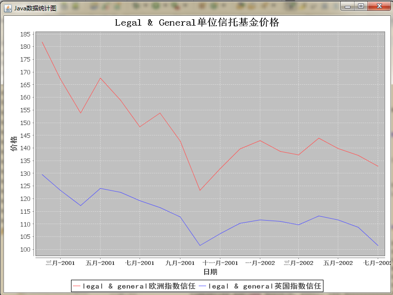
四 实现折线图的java代码:
|
1
2
3
4
5
6
7
8
9
10
11
12
13
14
15
16
17
18
19
20
21
22
23
24
25
26
27
28
29
30
31
32
33
34
35
36
37
38
39
40
41
42
43
44
45
46
47
48
49
50
51
52
53
54
55
56
57
58
59
60
61
62
63
64
65
66
67
68
69
70
71
72
73
74
75
76
77
78
79
|
package com.njue.testJFreeChart;
import java.awt.Font;
import java.text.SimpleDateFormat;
import org.jfree.chart.ChartFactory;
import org.jfree.chart.ChartPanel;
import org.jfree.chart.JFreeChart;
import org.jfree.chart.axis.DateAxis;
import org.jfree.chart.axis.ValueAxis;
import org.jfree.chart.plot.XYPlot;
import org.jfree.data.time.Month;
import org.jfree.data.time.TimeSeries;
import org.jfree.data.time.TimeSeriesCollection;
import org.jfree.data.xy.XYDataset;
public class TimeSeriesChart {
ChartPanel frame1;
public TimeSeriesChart(){
XYDataset xydataset = createDataset();
JFreeChart jfreechart = ChartFactory.createTimeSeriesChart( "Legal & General单位信托基金价格" , "日期" , "价格" ,xydataset, true , true , true );
XYPlot xyplot = (XYPlot) jfreechart.getPlot();
DateAxis dateaxis = (DateAxis) xyplot.getDomainAxis();
dateaxis.setDateFormatOverride( new SimpleDateFormat( "MMM-yyyy" ));
frame1= new ChartPanel(jfreechart, true );
dateaxis.setLabelFont( new Font( "黑体" ,Font.BOLD, 14 )); //水平底部标题
dateaxis.setTickLabelFont( new Font( "宋体" ,Font.BOLD, 12 )); //垂直标题
ValueAxis rangeAxis=xyplot.getRangeAxis(); //获取柱状
rangeAxis.setLabelFont( new Font( "黑体" ,Font.BOLD, 15 ));
jfreechart.getLegend().setItemFont( new Font( "黑体" , Font.BOLD, 15 ));
jfreechart.getTitle().setFont( new Font( "宋体" ,Font.BOLD, 20 )); //设置标题字体
}
private static XYDataset createDataset() { //这个数据集有点多,但都不难理解
TimeSeries timeseries = new TimeSeries( "legal & general欧洲指数信任" ,
org.jfree.data.time.Month. class );
timeseries.add( new Month( 2 , 2001 ), 181 .80000000000001D);
timeseries.add( new Month( 3 , 2001 ), 167 .30000000000001D);
timeseries.add( new Month( 4 , 2001 ), 153 .80000000000001D);
timeseries.add( new Month( 5 , 2001 ), 167 .59999999999999D);
timeseries.add( new Month( 6 , 2001 ), 158 .80000000000001D);
timeseries.add( new Month( 7 , 2001 ), 148 .30000000000001D);
timeseries.add( new Month( 8 , 2001 ), 153 .90000000000001D);
timeseries.add( new Month( 9 , 2001 ), 142 .69999999999999D);
timeseries.add( new Month( 10 , 2001 ), 123 .2D);
timeseries.add( new Month( 11 , 2001 ), 131 .80000000000001D);
timeseries.add( new Month( 12 , 2001 ), 139 .59999999999999D);
timeseries.add( new Month( 1 , 2002 ), 142 .90000000000001D);
timeseries.add( new Month( 2 , 2002 ), 138 .69999999999999D);
timeseries.add( new Month( 3 , 2002 ), 137 .30000000000001D);
timeseries.add( new Month( 4 , 2002 ), 143 .90000000000001D);
timeseries.add( new Month( 5 , 2002 ), 139 .80000000000001D);
timeseries.add( new Month( 6 , 2002 ), 137D);
timeseries.add( new Month( 7 , 2002 ), 132 .80000000000001D);
TimeSeries timeseries1 = new TimeSeries( "legal & general英国指数信任" ,
org.jfree.data.time.Month. class );
timeseries1.add( new Month( 2 , 2001 ), 129 .59999999999999D);
timeseries1.add( new Month( 3 , 2001 ), 123 .2D);
timeseries1.add( new Month( 4 , 2001 ), 117 .2D);
timeseries1.add( new Month( 5 , 2001 ), 124 .09999999999999D);
timeseries1.add( new Month( 6 , 2001 ), 122 .59999999999999D);
timeseries1.add( new Month( 7 , 2001 ), 119 .2D);
timeseries1.add( new Month( 8 , 2001 ), 116 .5D);
timeseries1.add( new Month( 9 , 2001 ), 112 .7D);
timeseries1.add( new Month( 10 , 2001 ), 101 .5D);
timeseries1.add( new Month( 11 , 2001 ), 106 .09999999999999D);
timeseries1.add( new Month( 12 , 2001 ), 110 .3D);
timeseries1.add( new Month( 1 , 2002 ), 111 .7D);
timeseries1.add( new Month( 2 , 2002 ), 111D);
timeseries1.add( new Month( 3 , 2002 ), 109 .59999999999999D);
timeseries1.add( new Month( 4 , 2002 ), 113 .2D);
timeseries1.add( new Month( 5 , 2002 ), 111 .59999999999999D);
timeseries1.add( new Month( 6 , 2002 ), 108 .8D);
timeseries1.add( new Month( 7 , 2002 ), 101 .59999999999999D);
TimeSeriesCollection timeseriescollection = new TimeSeriesCollection();
timeseriescollection.addSeries(timeseries);
timeseriescollection.addSeries(timeseries1);
return timeseriescollection;
}
public ChartPanel getChartPanel(){
return frame1;
}
}
|
效果图如下:
再来看一下主方法:
|
1
2
3
4
5
6
7
8
9
10
11
12
13
14
|
import java.awt.GridLayout;
import javax.swing.JFrame;
public class mainClass {
public static void main(String args[]){
JFrame frame= new JFrame( "Java数据统计图" );
frame.setLayout( new GridLayout( 2 , 2 , 10 , 10 ));
frame.add( new BarChart().getChartPanel()); //添加柱形图
frame.add( new BarChart1().getChartPanel()); //添加柱形图的另一种效果
frame.add( new PieChart().getChartPanel()); //添加饼状图
frame.add( new TimeSeriesChart().getChartPanel()); //添加折线图
frame.setBounds( 50 , 50 , 800 , 600 );
frame.setVisible( true );
}
}
|
五 总结
以上都是一个简单的例子去实现了,想了解更深的同学可自行查询资料,其实以上代码都通俗易懂,只要结合自己的实际情况,便可开发出属于自己的Application,大家可以看出我这里是在Application上实现的,其实更多情况数据统计图在javaweb上应用更多,大家也可自行了解。
Jfree实现统计图相关推荐
- java 统计图 mysql_java实现各种数据统计图(转)
转自:http://blog.csdn.net/pzhtpf/article/details/7600100 最近在做数据挖掘的课程设计,需要将数据分析的结果很直观的展现给用户,这就要用到数据统计图, ...
- jFreeChart+itext生成带统计图的pdf文件
jar包依赖 <!-- iText start--><!-- https://mvnrepository.com/artifact/com.itextpdf/itextpdf --& ...
- java实现各种数据统计图(柱形图,饼图,折线图)
最近在做数据挖掘的课程设计,需要将数据分析的结果很直观的展现给用户,这就要用到数据统计图,要实现这个功能就需要几个第三方包了: 1. jfreechart-1.0.13.jar 2. ...
- 使用java实现各种数据统计图(柱形图,饼图,折线图)
用Jfree实现条形柱状图表,java代码实现.可经常用于报表的制作,代码自动生成后可以自由查看.可以自由配置图表的各个属性,用来达到自己的要求和目的.本文给大家介绍使用java实现各种数据统计图(柱 ...
- 【统计图】Echarts实现多条折线图渐变堆叠效果
initSgLineChart() {// 基于DOM,初始化echarts实例(注意!Vue的DOM日怪的很,一般要腾个1秒才加载完)this.lineChart = this.$echarts.i ...
- 使用 Vml 制作立体柱状投票统计图的完整程序
作者:lshdic http://blog.csdn.net/lshdic/ <!--以下便是完整的 Js+Vml 制作柱状投票统计图的完整程序,保存为HTM文件运行即可看到效果 其中 ar ...
- 在asp.net中调用Office来制作各种(3D)统计图
作者:未知 由于本文网上多处见到 对于谁是作者 无法肯定 1.下载owc11 COM组件 http://www.microsoft.com/downloads/details.aspx?Famil ...
- R语言grafify包简单、快速绘制19个漂亮的统计图实战
R语言grafify包简单.快速绘制19个漂亮的统计图实战 目录 R语言grafify包简单.快速绘制19个漂亮的统计图实战 #grafify是什么?
- 快逸报表API直接生成v4统计图
客户需求: 之前遇到过客户希望后台直接获取到快逸生成统计图,当时给客户解决的方法是通过先在快逸报表中设置统计图,后台运算后,获取到报表单元格的值,转化成ImageValue对象. 实现准备: 1:了解 ...
最新文章
- python autopy_安装python autopy时出错
- 又一联盟成立:清华、北大、深大、南科大、哈工大等12家在深单位加盟
- attribute 'groups' of type 'int' is not usable in a script method
- pythonweb开发-pythonWeb开发
- python调用sqlldr_sqlldr导入数据
- AI+AR如何提升花椒直播的体验?
- mysql now的时间问题
- 用pyqt5做个图书馆数据管理客户端!--pyqt+mysql的使用(入门必看!)
- 阿里巴巴CTO程立:CTO就是要给CEO扫清障碍和风险
- UGUI直接修改Image的Color和用unity自带的UI Shadr修改_Color属性的区别
- jsp在校大学生助学贷款管理系统
- astah-professional 证书
- 金融直播营销,主播必须这样做!
- uva 10827 - Maximum sum on a torus
- halcon-画十字架
- html5图片和两行文字垂直居中显示,何如让文字跟图片垂直居中对齐
- 2021年教育改革大动作
- iOS 图标适配官网
- 描述流体中声学物理现象的三个基本方程
- Unity fog雾的三种模式