两个画图工具助力论文绘图
欢迎关注笔者的微信公众号
![]()
如果使用matplotlib绘制论文图片时需要做非常多的设置,字体,大小,间距,多子图配置等,而这些操作可以封装好从而简化用户工作量。Proplot对matplotlib进行了封装和美化,用户可以使用与matplotlib相似的操作就画出更精美的图片。SciencePlots是matplotlib的样式库,内置了很多样式供用户选择,用它画出的图片可以满足出版的要求。
Proplot
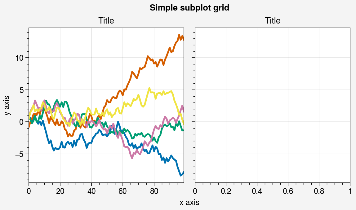
要使用proplot绘图,必须先调用 figure 或 subplots 。这些是根据同名的 pyplot 命令建模的。跟matplotlib.pyplot 一样,subplots 一次创建一个图形和一个子图网格,而 figure 创建一个空图形,之后可以用子图填充。下面显示了一个只有一个子图的最小示例。
安装
pip install proplot
conda install -c conda-forge proplot
# Simple subplot grid
import numpy as np
import proplot as pplt
import warnings
warnings.filterwarnings('ignore')
state = np.random.RandomState(51423)
data = 2 * (state.rand(100, 5) - 0.5).cumsum(axis=0)
fig = pplt.figure()
ax = fig.subplot(121)
ax.plot(data, lw=2)
ax = fig.subplot(122)
fig.format(suptitle='Simple subplot grid', title='Title',xlabel='x axis', ylabel='y axis'
)
# fig.save('~/example1.png')  # save the figure
# fig.savefig('~/example1.png')  # alternative
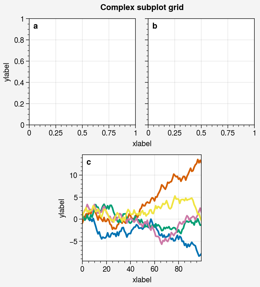
# Complex grid
import numpy as np
import proplot as pplt
state = np.random.RandomState(51423)
data = 2 * (state.rand(100, 5) - 0.5).cumsum(axis=0)
array = [  # the "picture" (0 == nothing, 1 == subplot A, 2 == subplot B, etc.)[1, 1, 2, 2],[0, 3, 3, 0],
]
fig = pplt.figure(refwidth=1.8)
axs = fig.subplots(array)
axs.format(abc=True, abcloc='ul', suptitle='Complex subplot grid',xlabel='xlabel', ylabel='ylabel'
)
axs[2].plot(data, lw=2)
# fig.save('~/example2.png')  # save the figure
# fig.savefig('~/example2.png')  # alternative
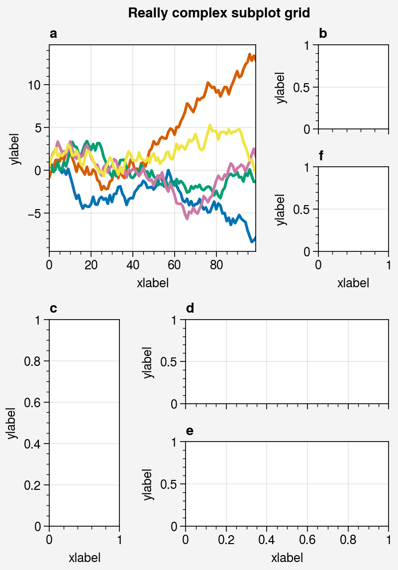
# Really complex grid
import numpy as np
import proplot as pplt
state = np.random.RandomState(51423)
data = 2 * (state.rand(100, 5) - 0.5).cumsum(axis=0)
array = [  # the "picture" (1 == subplot A, 2 == subplot B, etc.)[1, 1, 2],[1, 1, 6],[3, 4, 4],[3, 5, 5],
]
fig, axs = pplt.subplots(array, figwidth=5, span=False)
axs.format(suptitle='Really complex subplot grid',xlabel='xlabel', ylabel='ylabel', abc=True
)
axs[0].plot(data, lw=2)
# fig.save('~/example3.png')  # save the figure
# fig.savefig('~/example3.png')  # alternative
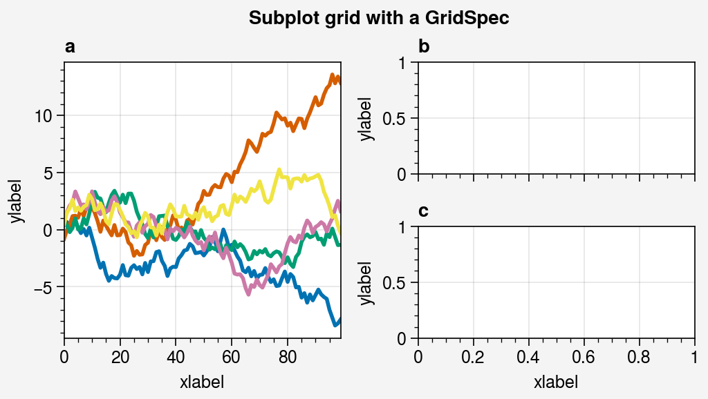
# Using a GridSpec
import numpy as np
import proplot as pplt
state = np.random.RandomState(51423)
data = 2 * (state.rand(100, 5) - 0.5).cumsum(axis=0)
gs = pplt.GridSpec(nrows=2, ncols=2, pad=1)
fig = pplt.figure(span=False, refwidth=2)
ax = fig.subplot(gs[:, 0])
ax.plot(data, lw=2)
ax = fig.subplot(gs[0, 1])
ax = fig.subplot(gs[1, 1])
fig.format(suptitle='Subplot grid with a GridSpec',xlabel='xlabel', ylabel='ylabel', abc=True
)
# fig.save('~/example4.png')  # save the figure
# fig.savefig('~/example4.png')  # alternative
import proplot as pplt
import numpy as np
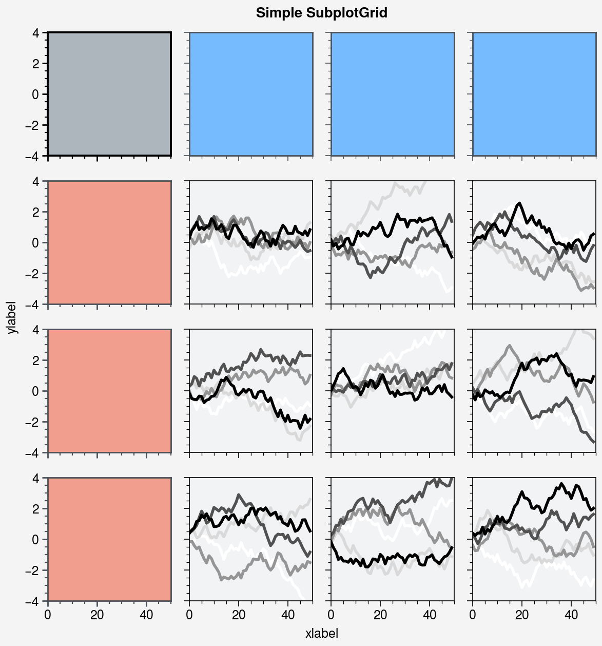
state = np.random.RandomState(51423)# Selected subplots in a simple grid
fig, axs = pplt.subplots(ncols=4, nrows=4, refwidth=1.2, span=True)
axs.format(xlabel='xlabel', ylabel='ylabel', suptitle='Simple SubplotGrid')
axs.format(grid=False, xlim=(0, 50), ylim=(-4, 4))
axs[:, 0].format(facecolor='blush', edgecolor='gray7', linewidth=1) # eauivalent
axs[:, 0].format(fc='blush', ec='gray7', lw=1)
axs[0, :].format(fc='sky blue', ec='gray7', lw=1)
axs[0].format(ec='black', fc='gray5', lw=1.4)
axs[1:, 1:].format(fc='gray1')
for ax in axs[1:, 1:]:ax.plot((state.rand(50, 5) - 0.5).cumsum(axis=0), cycle='Grays', lw=2)# Selected subplots in a complex grid
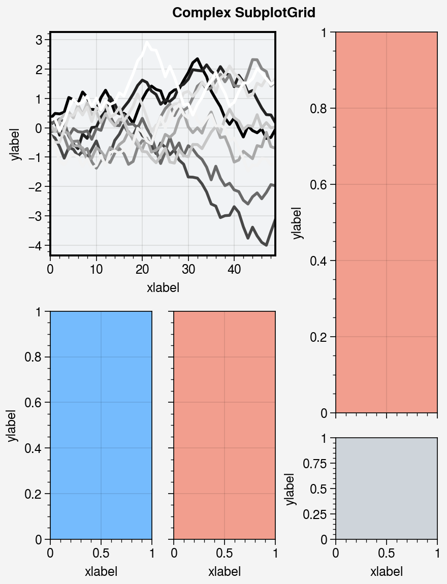
fig = pplt.figure(refwidth=1, refnum=5, span=False)
axs = fig.subplots([[1, 1, 2], [3, 4, 2], [3, 4, 5]], hratios=[2.2, 1, 1])
axs.format(xlabel='xlabel', ylabel='ylabel', suptitle='Complex SubplotGrid')
axs[0].format(ec='black', fc='gray1', lw=1.4)
axs[1, 1:].format(fc='blush')
axs[1, :1].format(fc='sky blue')
axs[-1, -1].format(fc='gray4', grid=False)
axs[0].plot((state.rand(50, 10) - 0.5).cumsum(axis=0), cycle='Grays_r', lw=2)
import proplot as pplt
import numpy as np# Sample data
N = 20
state = np.random.RandomState(51423)
data = N + (state.rand(N, N) - 0.55).cumsum(axis=0).cumsum(axis=1)# Example plots
cycle = pplt.Cycle('greys', left=0.2, N=5)
fig, axs = pplt.subplots(ncols=2, nrows=2, figwidth=5, share=False)
axs[0].plot(data[:, :5], linewidth=2, linestyle='--', cycle=cycle)
axs[1].scatter(data[:, :5], marker='x', cycle=cycle)
axs[2].pcolormesh(data, cmap='greys')
m = axs[3].contourf(data, cmap='greys')
axs.format(abc='a.', titleloc='l', title='Title',xlabel='xlabel', ylabel='ylabel', suptitle='Quick plotting demo'
)
fig.colorbar(m, loc='b', label='label')

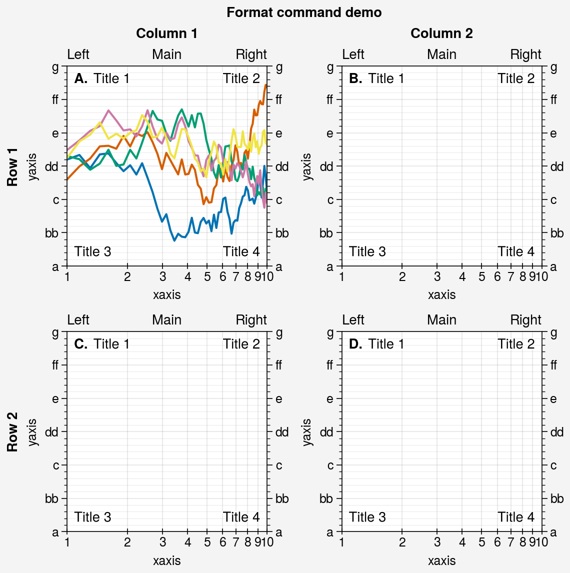
import proplot as pplt
import numpy as np
fig, axs = pplt.subplots(ncols=2, nrows=2, refwidth=2, share=False)
state = np.random.RandomState(51423)
N = 60
x = np.linspace(1, 10, N)
y = (state.rand(N, 5) - 0.5).cumsum(axis=0)
axs[0].plot(x, y, linewidth=1.5)
axs.format(suptitle='Format command demo',abc='A.', abcloc='ul',title='Main', ltitle='Left', rtitle='Right',  # different titlesultitle='Title 1', urtitle='Title 2', lltitle='Title 3', lrtitle='Title 4',toplabels=('Column 1', 'Column 2'),leftlabels=('Row 1', 'Row 2'),xlabel='xaxis', ylabel='yaxis',xscale='log',xlim=(1, 10), xticks=1,ylim=(-3, 3), yticks=pplt.arange(-3, 3),yticklabels=('a', 'bb', 'c', 'dd', 'e', 'ff', 'g'),ytickloc='both', yticklabelloc='both',xtickdir='inout', xtickminor=False, ygridminor=True,
)
import proplot as pplt
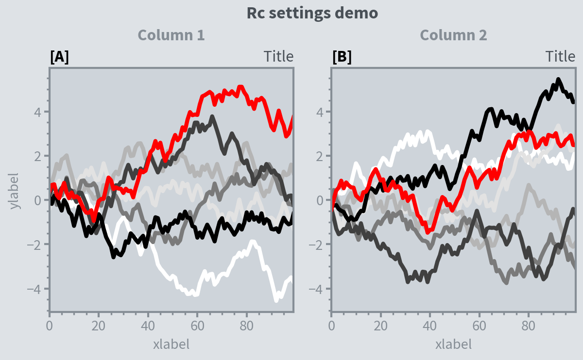
import numpy as np# Update global settings in several different ways
pplt.rc.metacolor = 'gray6'
pplt.rc.update({'fontname': 'Source Sans Pro', 'fontsize': 11})
pplt.rc['figure.facecolor'] = 'gray3'
pplt.rc.axesfacecolor = 'gray4'
# pplt.rc.save() # save the current settings to ~/.proplotrc# Apply settings to figure with context()
with pplt.rc.context({'suptitle.size': 13}, toplabelcolor='gray6', metawidth=1.5):fig = pplt.figure(figwidth=6, sharey='limits', span=False)axs = fig.subplots(ncols=2)# Plot lines with a custom cycler
N, M = 100, 7
state = np.random.RandomState(51423)
values = np.arange(1, M + 1)
cycle = pplt.get_colors('grays', M - 1) + ['red']
for i, ax in enumerate(axs):data = np.cumsum(state.rand(N, M) - 0.5, axis=0)lines = ax.plot(data, linewidth=3, cycle=cycle)# Apply settings to axes with format()
axs.format(grid=False, xlabel='xlabel', ylabel='ylabel',toplabels=('Column 1', 'Column 2'),suptitle='Rc settings demo',suptitlecolor='gray7',abc='[A]', abcloc='l',title='Title', titleloc='r', titlecolor='gray7'
)# Reset persistent modifications from head of cell
pplt.rc.reset()
import proplot as pplt
import numpy as np
# pplt.rc.style = 'style'  # set the style everywhere# Sample data
state = np.random.RandomState(51423)
data = state.rand(10, 5)# Set up figure
fig, axs = pplt.subplots(ncols=2, nrows=2, span=False, share=False)
axs.format(suptitle='Stylesheets demo')
styles = ('ggplot', 'seaborn', '538', 'bmh')# Apply different styles to different axes with format()
for ax, style in zip(axs, styles):ax.format(style=style, xlabel='xlabel', ylabel='ylabel', title=style)ax.plot(data, linewidth=3)

SciencePlots
安装
# to install the lastest release (from PyPI)
pip install SciencePlots# to install the latest commit (from GitHub)
pip install git+https://github.com/garrettj403/SciencePlots# to clone and install from a local copy
git clone https://github.com/garrettj403/SciencePlots.git
cd SciencePlots
pip install -e .
根据系统不同,需要提前安装latex环境
例子
import numpy as np
import matplotlib
import matplotlib.pyplot as plt
matplotlib.style.reload_library()
matplotlib.rcParams['axes.unicode_minus'] = Falsedef model(x, p):return x ** (2 * p + 1) / (1 + x ** (2 * p))pparam = dict(xlabel='Voltage (mV)', ylabel='Current ($\mu$A)')x = np.linspace(0.75, 1.25, 201)
with plt.style.context(['science']):fig, ax = plt.subplots()for p in [10, 15, 20, 30, 50, 100]:ax.plot(x, model(x, p), label=p)ax.legend(title='Order')# ax.autoscale(tight=True)ax.set(**pparam)# fig.savefig('figures/fig1.pdf')fig.savefig('figures/fig1.jpg', dpi=300)
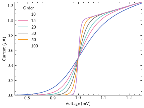
with plt.style.context(['science', 'ieee', 'notebook']):fig, ax = plt.subplots()for p in [10, 20, 40, 100]:ax.plot(x, model(x, p), label=p)ax.legend(title='Order')ax.autoscale(tight=True)ax.set(**pparam)# Note: $\mu$ doesn't work with Times font (used by ieee style)ax.set_ylabel(r'$Current (\mu A)$') # fig.savefig('figures/fig2a.pdf')fig.savefig('figures/fig2a.jpg', dpi=300)

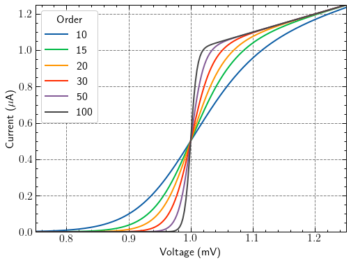
with plt.style.context(['science', 'ieee', 'std-colors', 'notebook']):fig, ax = plt.subplots()for p in [10, 15, 20, 30, 50, 100]:ax.plot(x, model(x, p), label=p)ax.legend(title='Order')ax.autoscale(tight=True)ax.set(**pparam)# Note: $\mu$ doesn't work with Times font (used by ieee style)ax.set_ylabel(r'$Current (\mu A)$') # fig.savefig('figures/fig2b.pdf')fig.savefig('figures/fig2b.jpg', dpi=300)
with plt.style.context(['science', 'high-vis', 'notebook']):fig, ax = plt.subplots()for p in [10, 15, 20, 30, 50, 100]:ax.plot(x, model(x, p), label=p)ax.legend(title='Order')ax.autoscale(tight=True)ax.set(**pparam)# fig.savefig('figures/fig4.pdf')fig.savefig('figures/fig4.jpg', dpi=300)
with plt.style.context(['dark_background', 'science', 'high-vis', 'notebook']):fig, ax = plt.subplots()for p in [10, 15, 20, 30, 50, 100]:ax.plot(x, model(x, p), label=p)ax.legend(title='Order')ax.autoscale(tight=True)ax.set(**pparam)# fig.savefig('figures/fig5.pdf')fig.savefig('figures/fig5.jpg', dpi=300)
with plt.style.context(['science', 'notebook']):fig, ax = plt.subplots()for p in [10, 15, 20, 30, 50, 100]:ax.plot(x, model(x, p), label=p)ax.legend(title='Order')ax.autoscale(tight=True)ax.set(**pparam)# fig.savefig('figures/fig10.pdf')fig.savefig('figures/fig10.jpg', dpi=300)

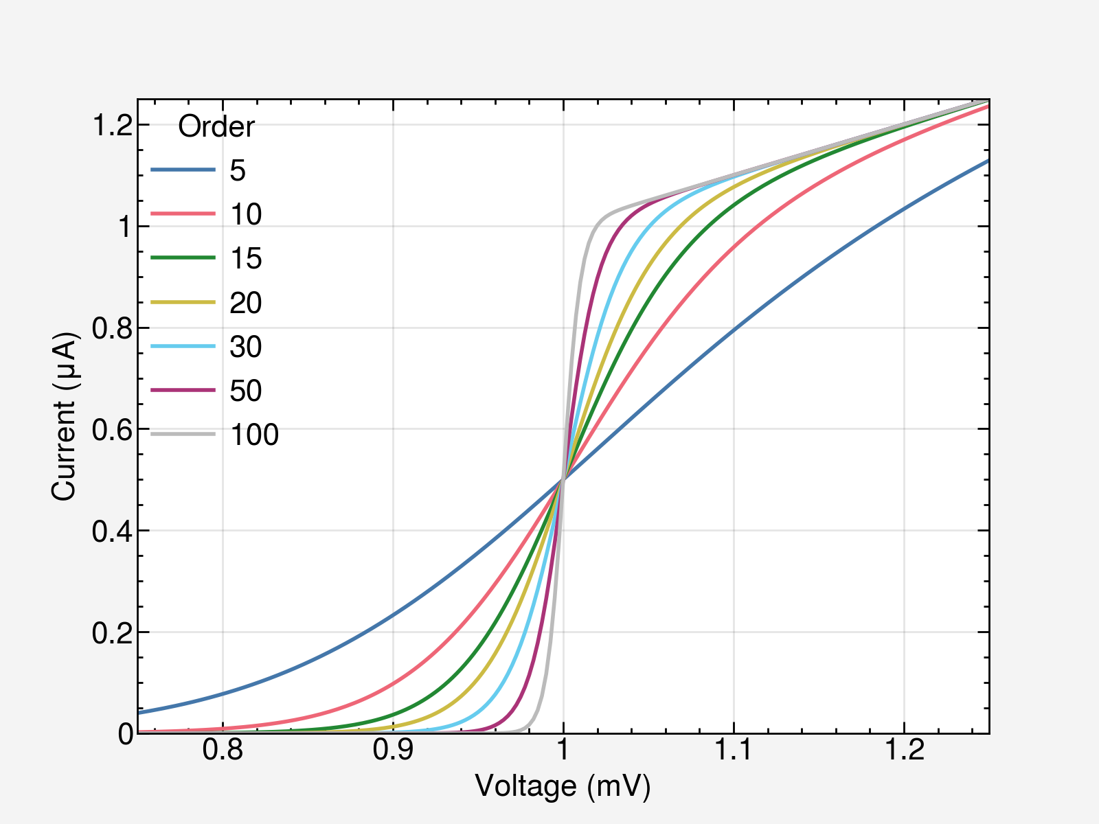
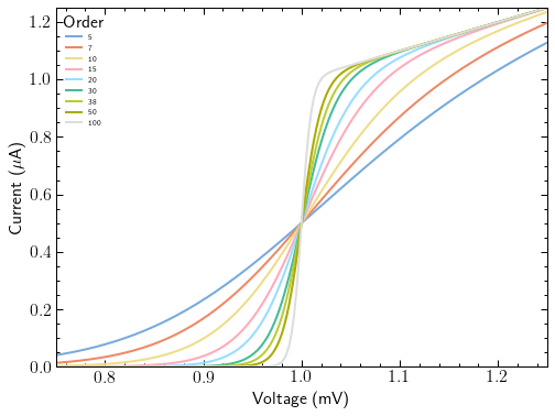
with plt.style.context(['science', 'bright', 'notebook']):fig, ax = plt.subplots()for p in [5, 10, 15, 20, 30, 50, 100]:ax.plot(x, model(x, p), label=p)ax.legend(title='Order')ax.autoscale(tight=True)ax.set(**pparam)# fig.savefig('figures/fig6.pdf')fig.savefig('figures/fig6.jpg', dpi=300)

with plt.style.context(['science', 'muted', 'notebook']):fig, ax = plt.subplots()for p in [5, 7, 10, 15, 20, 30, 38, 50, 100, 500]:ax.plot(x, model(x, p), label=p)ax.legend(title='Order', fontsize=7)ax.autoscale(tight=True)ax.set(**pparam)# fig.savefig('figures/fig8.pdf')fig.savefig('figures/fig8.jpg', dpi=300)

with plt.style.context(['science', 'grid', 'notebook']):fig, ax = plt.subplots()for p in [10, 15, 20, 30, 50, 100]:ax.plot(x, model(x, p), label=p)ax.legend(title='Order')ax.autoscale(tight=True)ax.set(**pparam)# fig.savefig('figures/fig11.pdf')fig.savefig('figures/fig11.jpg', dpi=300)
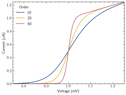
with plt.style.context(['science', 'high-contrast', 'notebook']):fig, ax = plt.subplots()for p in [10, 20, 50]:ax.plot(x, model(x, p), label=p)ax.legend(title='Order')ax.autoscale(tight=True)ax.set(**pparam)# fig.savefig('figures/fig12.pdf')fig.savefig('figures/fig12.jpg', dpi=300)
with plt.style.context(['science', 'light', 'notebook']):fig, ax = plt.subplots()for p in [5, 7, 10, 15, 20, 30, 38, 50, 100]:ax.plot(x, model(x, p), label=p)ax.legend(title='Order', fontsize=7)ax.autoscale(tight=True)ax.set(**pparam)# fig.savefig('figures/fig13.pdf')fig.savefig('figures/fig13.jpg', dpi=300)
参考资料
- https://proplot.readthedocs.io
- https://github.com/garrettj403/SciencePlots
两个画图工具助力论文绘图相关推荐
- matlab学位论文绘图美化工具_学术论文绘图matlab版
论文绘图是完成学术论文的一个重要环节,美观的插图能够更好地阐述结论和有效地提升文章质量.学术论文中常见的插图包括:框架图,算法说明图,数据分析图,以及实物图.常见的绘图工具中包括Matlab,pyth ...
- matlab学位论文绘图美化工具_推荐几个超级好用的工具,让你在论文中画出漂亮的插图...
每次我们看到优秀期刊中的文章,比如<Nature>.<Cell>,我们都会被文章中的插图惊艳到.再瞅瞅我们自己论文中的插图,总觉得比别人low了好几个c层次.一个好看的插图绝对 ...
- python脚本绘图_python实现画图工具
简易画图工具(Python),供大家参考,具体内容如下 小黑最近在努力的入门python,正好学习到了Python的tkinker模块下的Canvas(画布)和Button(按钮)再加上相应的事务管理 ...
- 论文绘图软件和论文赶稿注意事项+ESLWriter自助写论文+论文排版和LaTeX书写方法介绍
1.论文绘图软件 第10名:锯齿风Matlab Matlab只排在第十位是因为本来它就不是一个用来做画图的软件.人家的主要功能是矩阵操作.统筹优化.数学实验.仿真模拟(此处省略一万字)等等好吗?用ma ...
- 程序员应该知道的那些画图工具-第一期
偶尔讲讲工具,放松一下. 现在写技术文章不但要写技术细节,图还得画的好看.对于表达思路和架构来说,图确实挺直观的,这篇文章介绍一下常见的绘图工具.大家可以看自己的喜好自行选择. 在早期写 golang ...
- 手把手教你写高质量Android技术博客,画图工具,录像工具,Markdown写法
前言 作为程序员,写博客是一件很有意义的事情,可以加深自己对技术的理解,可以结交更多的朋友,记录自己的技术轨迹,而且分享可以让更多的人从中受益,独乐乐不如众乐乐嘛. 但是要写好博客也不是件容易的事,一 ...
- 基础画图工具matplotlib
matplotlib的基本了解 - Matplotlib- matplotlib是什么?- matplotlib的基本要点- matplotlib的折线图, 柱状图, 直方图, 散点图;- 更多的画图 ...
- 使用画图工具draw.io的嵌入模式实现uml图绘制功能的尝试(1)
使用画图工具draw.io的嵌入模式实现uml图绘制功能的尝试(2) 使用画图工具draw.io的嵌入模式实现uml图绘制功能的尝试(3) 正在编写的本科毕设项目中要求实现绘制UML图的需求,我搜索了 ...
- 小学计算机画图课件第一册,小学信息技术- 有趣的画图工具 课件.ppt
文档介绍: 小学信息技术-_有趣的画图工具_课件有趣的画图工具 信息课说课 家纬瓤富襄了嗡说多已迂睛耍署璃氖缸畸季蘑含好足享碉迄砍龄朵淖誓唁小学信息技术-_有趣的画图工具_课件小学信息技术-_有趣的画 ...
- 这些论文绘图软件,你一个都不会用
这些论文绘图软件,你一个都不会用 量化研究方法 引言 众所周知,高水平的配图可以令论文.报告等显得耳目一新,瞬间提高一个档次.写文章.做报告,搞好配图已经成为了又一项标配技能.从大量的数据资料中获得所 ...
最新文章
- ORACLE日期加减【转】
- 交换两个变量ab的值PHP,由[交换两个变量的值问题]理解程序的时空复杂度
- Memcached Client 使用手册
- php多进程有什么用,有关php多进程的用法举例
- mysql无法初始化数据库引擎_mysql使用模板解决旧数据处理,默认初始化数据的通用方法!...
- 专转本计算机专业录取分数线,2018江苏专转本各专业分数线一览!
- 我画了35张图,就是为了让你深入 AQS!
- python中locked_Python锁类| 带示例的locked()方法
- linux as5 启动mysql_RedHat AS5 PHP添加JSON模块
- 一个正经的前端学习 开源 仓库(阶段十九)
- php sql注入教程,PHP简单高效防御sql注入的方法分享
- Android开发中的常用库
- msxml6 x86.msi v6.10.1129.0
- 百度祝恒书:百度智能招聘技术和应用实践
- 读庄子-万物齐一和自然无为
- 我对TCP协议的一点形而上的看法
- 黑群晖内网穿透【免费无公网IP】
- Ilog cplex, java 表示分段线性函数 piecewise function
- 水果店线下营销玩法有哪些,水果店前期营销方案有哪些
- 复旦教授报告400多个安卓漏洞,历时16个月谷歌终于修复,此前曾立flag