2)前端的css排版布局
回顾重点:
伪元素选择器:
<!DOCTYPE html>
<html lang="en">
<head>
<meta charset="UTF-8">
<title>Title</title>
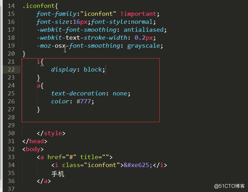
<style type="text/css">
p:first-letter{
color: red;
}
</style>
</head>
<body>
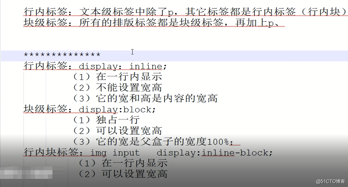
<p>李晓峰</p>
</body>
</html>
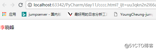
在名字前面加字段博客作者:
<!DOCTYPE html>
<html lang="en">
<head>
<meta charset="UTF-8">
<title>Title</title>
<style type="text/css">
p:first-letter{
color: red;
}
p:before{
content: '博客作者'
}
</style>
</head>
<body>
<p>李晓峰</p>
</body>
</html>
<!DOCTYPE html>
<html lang="en">
<head>
<meta charset="UTF-8">
<title>Title</title>
<style type="text/css">
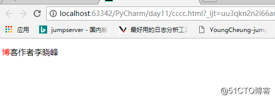
p::first-letter{
color: red;
}
p::before{
content: '博客作者';
}
p::after{
content: '.';
}
</style>
</head>
<body>
<p>李晓峰</p>
</body>
</html>
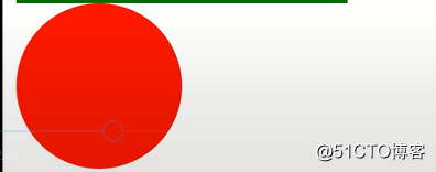
p::after{
content: '.';
/*设置成块标签*/
display: block;
width: 100px;
height: 100px;
background-color: green;
}
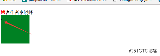
<!DOCTYPE html>
<html lang="en">
<head>
<meta charset="UTF-8">
<title>Title</title>
<style type="text/css">
p::first-letter{
color: red;
}
p::before{
content: '博客作者';
}
p::after{
content: '.';
/*设置成块标签*/
display: block;
/*width: 100px;*/
/*height: 100px;*/
/*background-color: green;*/
/*visibility: hidden;*/
}
</style>
</head>
<body>
<p>李晓峰</p>
<div>nginx</div>
</body>
</html>
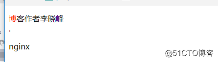
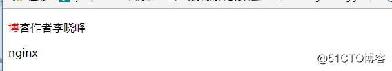
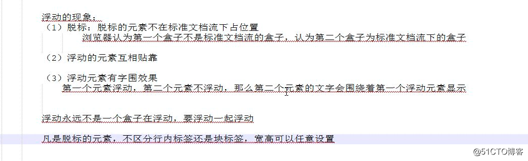
解决浮动带来的问题:
p::after{
content: '.';
/*设置成块标签*/
display: block;
/*width: 100px;*/
/*height: 100px;*/
/*background-color: green;*/
visibility: hidden;
height:0;
}
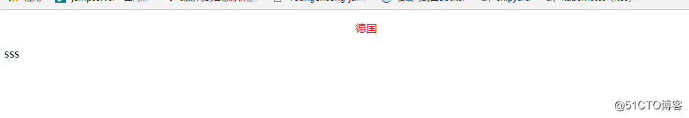
文字在中间显示:
<!DOCTYPE html>
<html lang="en">
<head>
<meta charset="UTF-8">
<title>Title</title>
<style type="text/css" media="screen">
div p{
color: red;
text-align: center;
}
</style>
</head>
<body>
<div>
<p>
德国
</p>
</div>
<p>sss</p>
</body>
</html>
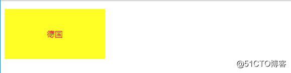
<!DOCTYPE html>
<html lang="en">
<head>
<meta charset="UTF-8">
<title>Title</title>
<style type="text/css" media="screen">
div p{
color: red;
width: 100px;
font-size: 20px;
background-color: green;
text-align: center;
line-height: 100px;
}
</style>
</head>
<body>
<div>
<p>
德国
</p>
</div>
</body>
</html>
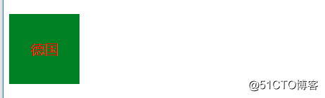
<!DOCTYPE html>
<html lang="en">
<head>
<meta charset="UTF-8">
<title>Title</title>
<style type="text/css" media="screen">
div {
color: red;
width: 200px;
background-color: green;
text-align: center;
line-height: 100px;
}
p{
background-color: yellow;
}
</style>
</head>
<body>
<div>
<p>
德国
</p>
</div>
</body>
</html>
(1)css的继承性:
继承来的属性权重为0,如果权重都为0,谁描述的近谁优先
#tt{}
.active{}
继承和权重
记住:有一些属性是可以继承下来 : color 、 font-*、 text-*、line-* 。主要是文本级的标签元素。
但是像一些盒子元素属性,定位的元素(浮动,绝对定位,固定定位)不能继承。
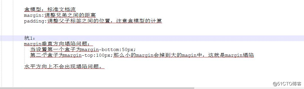
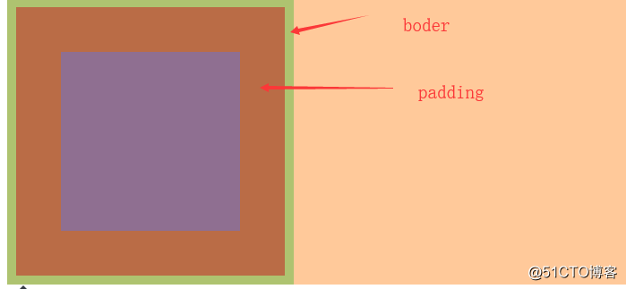
盒模型:
<!DOCTYPE html>
<html lang="en">
<head>
<meta charset="UTF-8">
<title>Title</title>
<style type="text/css">
div{
width: 200px;
height: 200px;
background-color: red;
padding: 50px;
border: 10px solid green;
}
</style>
</head>
<body>
<div>
</div>
</body>
</html>
border-top: 10px solid red;
border-right: 10px solid red;
border-bottom: 10px solid red;
border-left: 10pxb solid red;
举例:
<style type="text/css">
div{
width: 200px;
height: 200px;
background-color: red;
padding: 50px;
border-top: 10px solid grey;
</style>
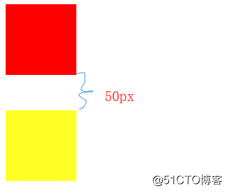
Margin:(填坑):
<!DOCTYPE html>
<html lang="en">
<head>
<meta charset="UTF-8">
<title>Title</title>
<style type="text/css">
.box{
width: 100px;
height: 100px;
background-color: red;
margin-bottom: 50px;
}
.box2{
width: 100px;
height: 100px;
background-color: yellow;
}
</style>
</head>
<body>
<div class="box">
</div>
<div class="box2"></div>
</body>
</html>
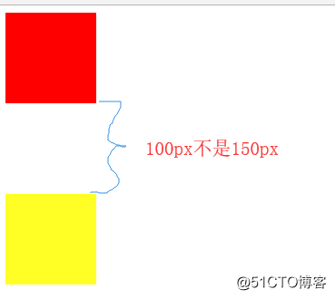
Margin 塌陷:
.box{
width: 100px;
height: 100px;
background-color: red;
margin-bottom: 50px;
}
.box2{
width: 100px;
height: 100px;
background-color: yellow;
margin-top: 100px;
}
</style>
span{
background-color: #0000CC }
.t{
margin-right: 50px;
}
.f{
margin-left: 30px;
}
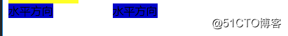
注::要写垂直距离在一个上面写不要写两个,水平的没问题
标准文档流:
(1)空白折叠现象
(2)高矮不齐,底边对齐
(3)自动换行,一行写不满,换行写
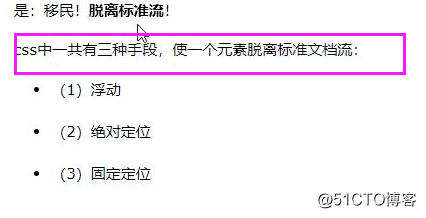
实例:
<!DOCTYPE html>
<html lang="en">
<head>
<meta charset="UTF-8">
<title>Title</title>
<style type="text/css">
*{
padding: 0;
margin: 0px;
}
div{
width: 200px;
height: 200px;
}
.box1{
background-color: red;
}
.box2{
background-color: green;
}
.box3{
background-color: yellow;
}
</style>
</head>
<body>
<div class="box1">
</div>
<div class="box2">
</div>
<div class="box3">
</div>
</body>
</html>
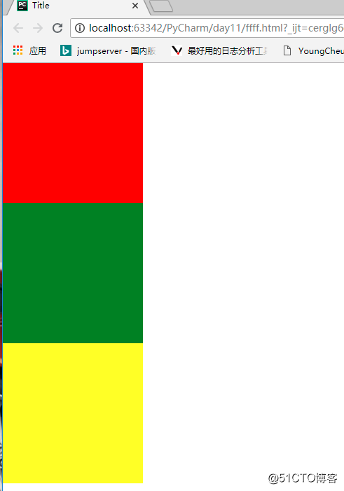
*{
padding: 0;
margin: 0px;
}
div{
width: 200px;
height: 200px;
}
.box1{
background-color: red;
float: left;
}
.box2{
background-color: green;
width: 230px;
}
.box3{
background-color: yellow;
}
</style>
<style type="text/css">
*{
padding: 0;
margin: 0px;
}
div{
width: 200px;
height: 200px;
}
.box1{
background-color: red;
float: left;
}
.box2{
background-color: green;
width: 230px;
float: left;
}
.box3{
background-color: yellow;
height: 230px;
}
</style>
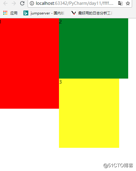
贴边现象:
<style type="text/css">
*{
padding: 0;
margin: 0px;
}
div{
width: 200px;
height: 200px;
}
.box1{
background-color: red;
float: left;
height: 300px;
}
.box2{
background-color: green;
width: 230px;
float: left;
}
.box3{
background-color: yellow;
height: 230px;
float: left;
}
</style>
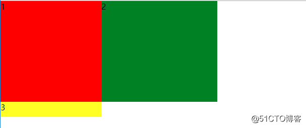
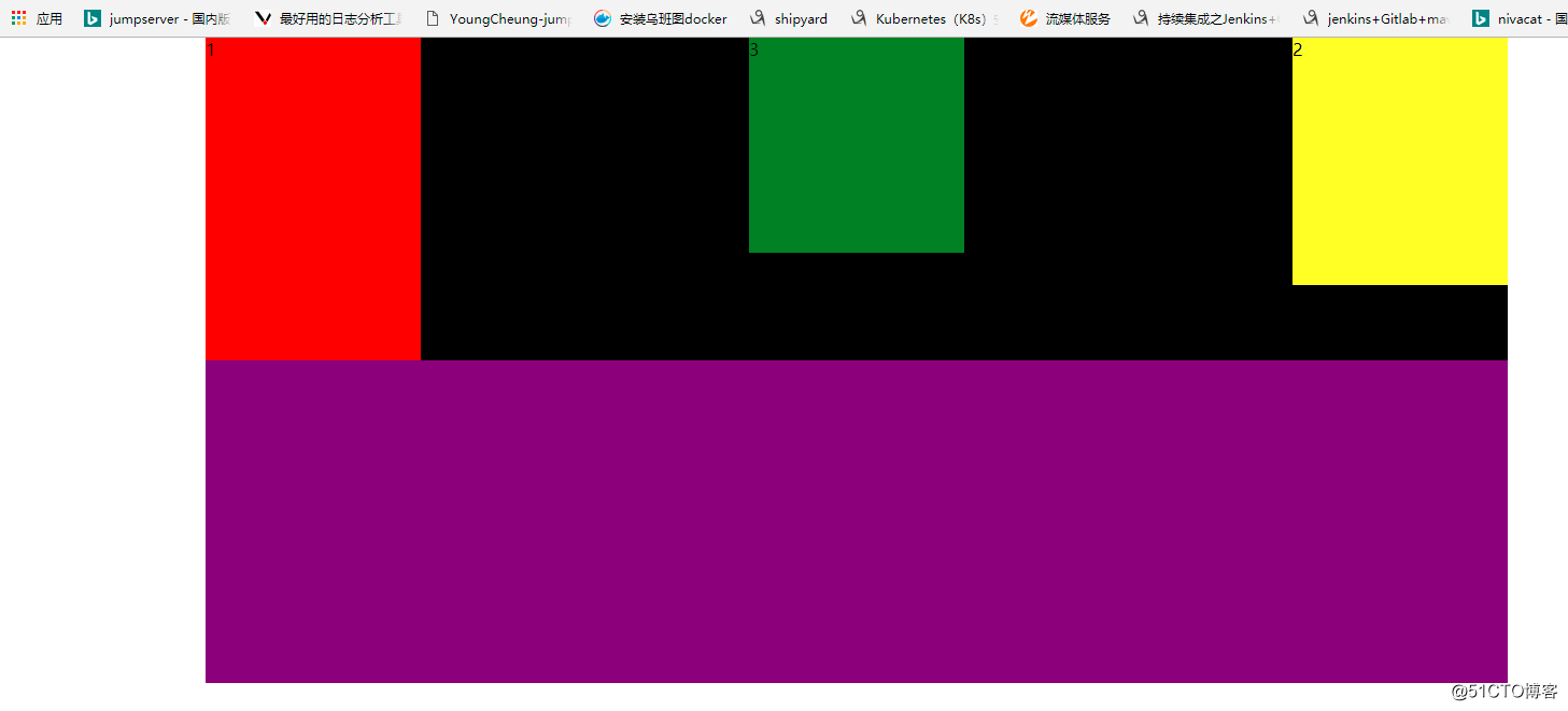
浮动的好处:
<!DOCTYPE html>
<html lang="en">
<head>
<meta charset="UTF-8">
<title>Title</title>
<style type="text/css">
*{
padding: 0px;
margin: 0;
}
.father{
width: 1210px;
height: 300px;
margin: 0 auto;
background-color: black;
}
.box1{
background-color: red;
height: 300px;
width: 200px;
float: left;
}
.box2{
background-color: yellow;
height: 230px;
width: 200px;
float: right;
}
.box3{
background-color: green;
height: 200px;
width: 200px;
margin: 0 auto;
}
.active{
width: 1210px;
height: 300px;
background-color: purple;
margin: 0 auto;
}
</style>
</head>
<body>
<div class="father">
<div class="box1">
1
</div>
<div class="box2">
2
</div>
<div class="box3">
3
</div>
</div>
<div class="active"></div>
</body>
</html>
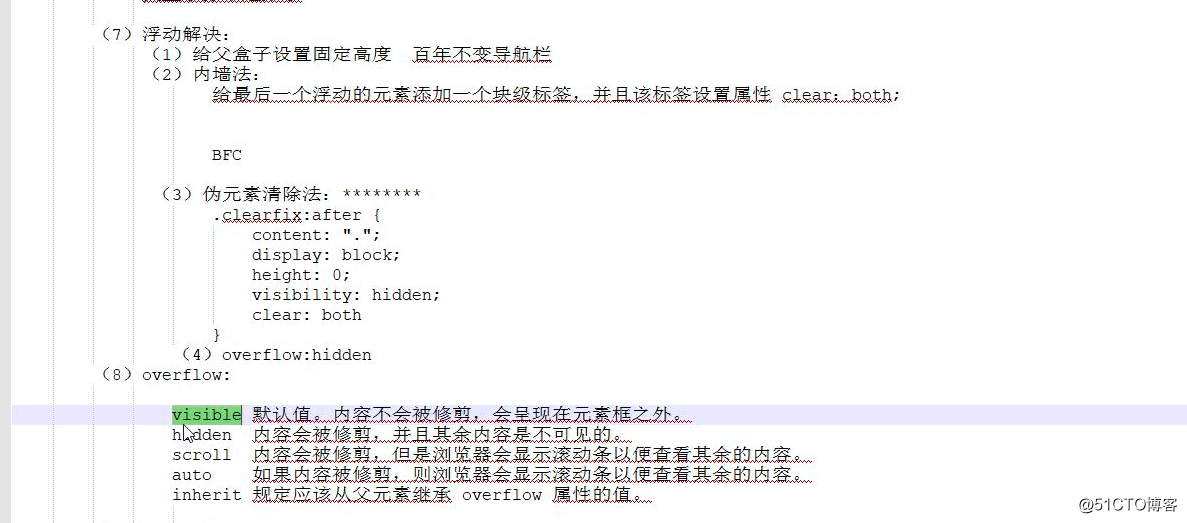
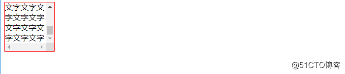
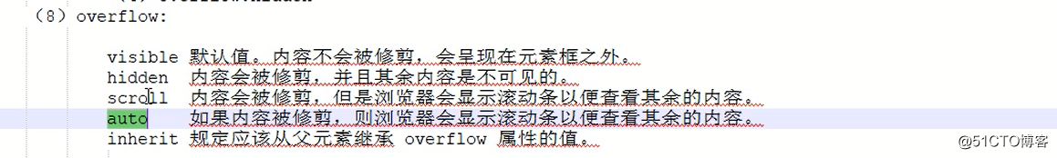
Overflow:
<!DOCTYPE html>
<html lang="en">
<head>
<meta charset="UTF-8">
<title>Title</title>
<style type="text/css">
div{
width: 100px;
height: 100px;
border: 1px solid red;
overflow:scroll;
}
</style>
</head>
<body>
<div>文字文字文字文字文字文字文字文字文字文字文
字文字文字文字文字文字文字文字文字文字文字文字
字文字文字文字文字文字文字文字文字文字文字文字
字文字文字文字文字文字文字文字文字文字文字文字
文字文字文字文字文字文字文字文字文字文字文字</div>
</body>
</html>
Margin:
如果漂浮的盒子不存在margin的塌陷
<!DOCTYPE html>
<html lang="en">
<head>
<meta charset="UTF-8">
<title>Title</title>
<style type="text/css">
*{
padding:0;
margin: 0px;
}
.head{
width: 100%;
height: 80px;
background-color:black;
padding-top: 20px;
}
.container{
width: 1210px;
margin: 0 auto;
background-color: deeppink;
}
.head .logo{
width: 50px;
height: 50px;
background-color:#ff6700;
}
</style>
</head>
<body>
<div class="head">
<div class="container">
<div class="logo">
</div>
</div>
</div>
</body>
</html>
<!DOCTYPE html>
<html lang="en">
<head>
<meta charset="UTF-8">
<title>Title</title>
<style type="text/css">
*{
padding:0;
margin: 0px;
}
.head{
width: 100%;
height: 100px;
background-color:black;
/*padding-top: 20px;*/
}
.container{
width: 1210px;
margin: 0 auto;
background-color:lawngreen;
}
.head .logo{
width: 50px;
height: 50px;
background-color:#ff6700;
float: left;
margin-top: 20px;
}
</style>
</head>
<body>
<div class="head">
<div class="container">
<div class="logo">
</div>
</div>
</div>
</body>
</html>
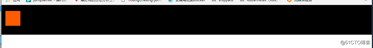
总结漂浮的盒子是不能够margin 0 auto居中的
添加:
font-size: 30px;
调整字体大小
list-style: none;
去除圆点的
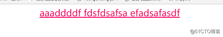
<!DOCTYPE html>
<html lang="en">
<head>
<meta charset="UTF-8">
<title>Title</title>
<style type="text/css">
div{
font-size: 30px;
/*开头空两个字符*/
text-indent: 2em;
/*加下滑线*/
text-decoration: underline;
/*变成小手*/
cursor: pointer;
/*高度居中*/
line-height: 40px;
/*文本居中*/
text-align: center;
}
</style>
</head>
<body>
<div>
aaaddddf fdsfdsafsa efadsafasdf
</div>
</body>
</html>
border-radius: 50px;
这个是用来切园的 可以100% 或者50%
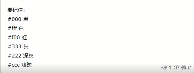
Background 颜色:
Rgb表示法、十六进制表示法
Rgb:红色、蓝色、绿色 三种原色组成
color: rgb(220,0,110);
图片平铺:
<!DOCTYPE html>
<html lang="en">
<head>
<meta charset="UTF-8">
<title>Title</title>
<style type="text/css">
.jieyi{
width: 1200px;
height: 1000px;
background-image: url("./jieyi.jpg");
}
</style>
</head>
<body>
<div class="jieyi">
</div>
</body>
</html>
<!DOCTYPE html>
<html lang="en">
<head>
<meta charset="UTF-8">
<title>Title</title>
<style type="text/css">
.jieyi{
width: 1200px;
height: 1000px;
background-image: url("./jieyi.jpg");
/*不平埔 */
background-repeat: no-repeat;
}
</style>
</head>
<body>
<div class="jieyi">
</div>
</body>
</html>
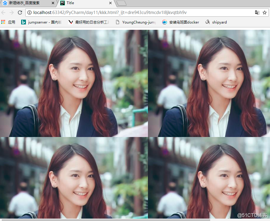
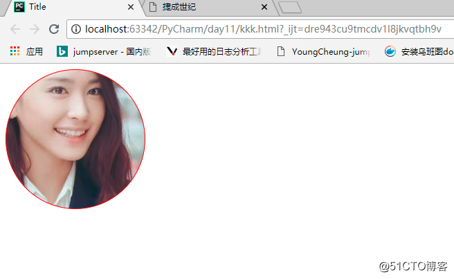
这个就是精灵图技术:
接下来切割圆形头像:
<!DOCTYPE html>
<html lang="en">
<head>
<meta charset="UTF-8">
<title>Title</title>
<style type="text/css">
.jieyi{
border: 1px solid red;
/*想左和上面移动剩下的数值*/
width: 200px;
height: 200px;
background-image: url("./jieyi.jpg");
/*不平埔 */
background-repeat: no-repeat;
/*想左和上面移动的px*/
background-position: -180px -100px;
border-radius: 50%;
}
</style>
</head>
<body>
<div class="jieyi">
</div>
</body>
</html>
可以动态的去调整:
<!DOCTYPE html>
<html lang="en">
<head>
<meta charset="UTF-8">
<title>Title</title>
<style type="text/css">
.jieyi{
border: 1px solid red;
/*想左和上面移动剩下的数值*/
width: 200px;
height: 200px;
background-image: url("./jieyi.jpg");
/*不平埔 */
background-repeat: no-repeat;
/*想左和上面移动的px*/
/*background-position: -180px -100px;*/
border-radius: 50%;
background-attachment: fixed;
margin-left: 150px;
margin-top: 150px;
}
</style>
</head>
<body style="height: 2000px; width: 2000px">
<div class="jieyi">
</div>
</body>
</html>
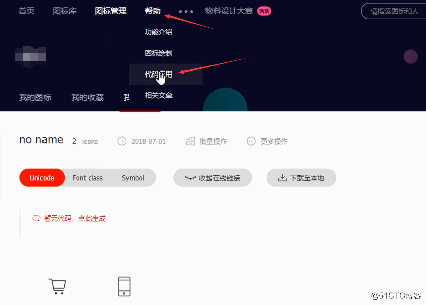
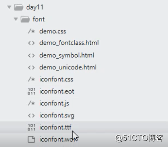
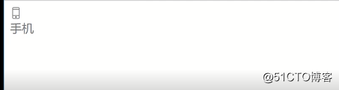
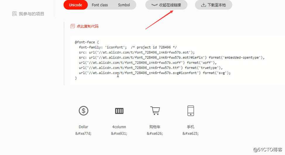
www.iconfont.cn 阿里巴巴图标库中选择图标
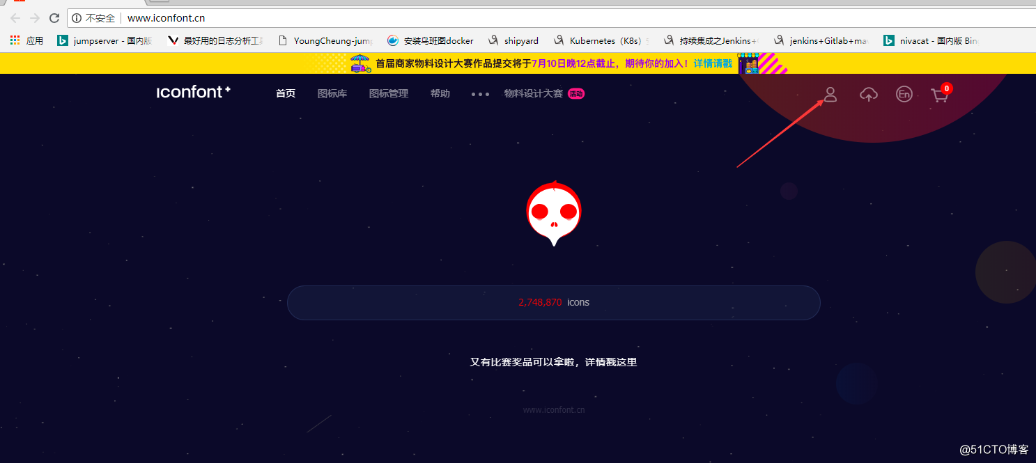
选择要使用的图标:
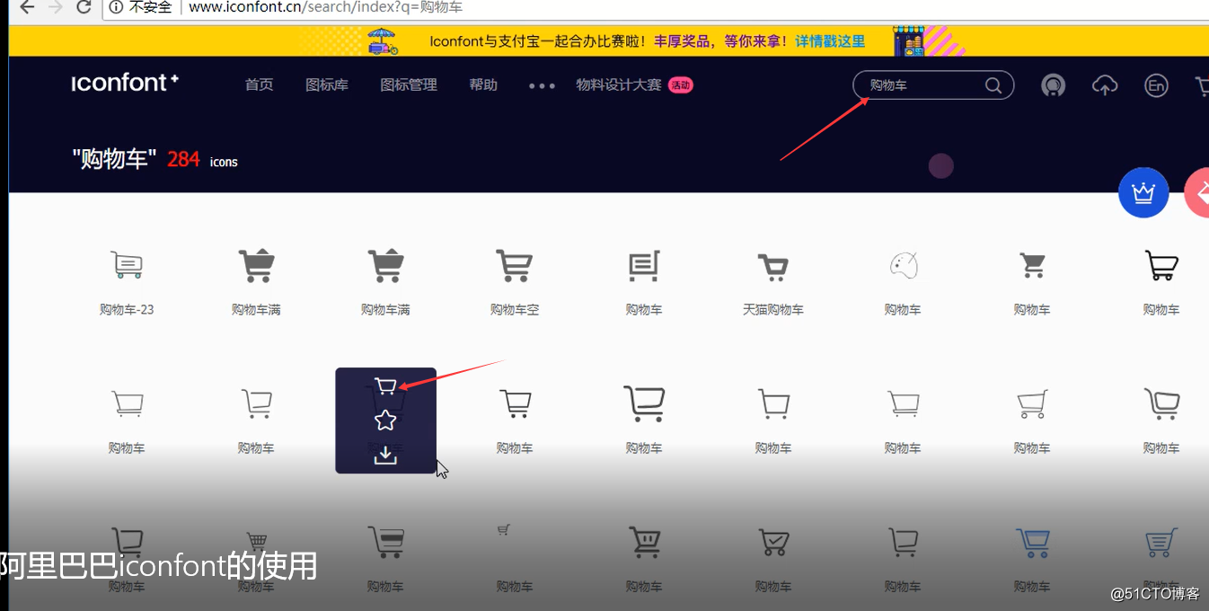
然后在购物车中选择:
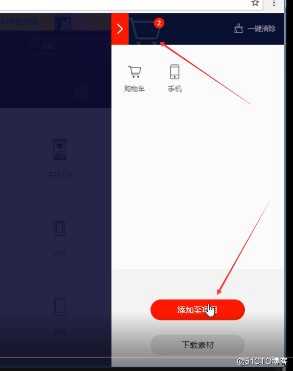
然后会出现:
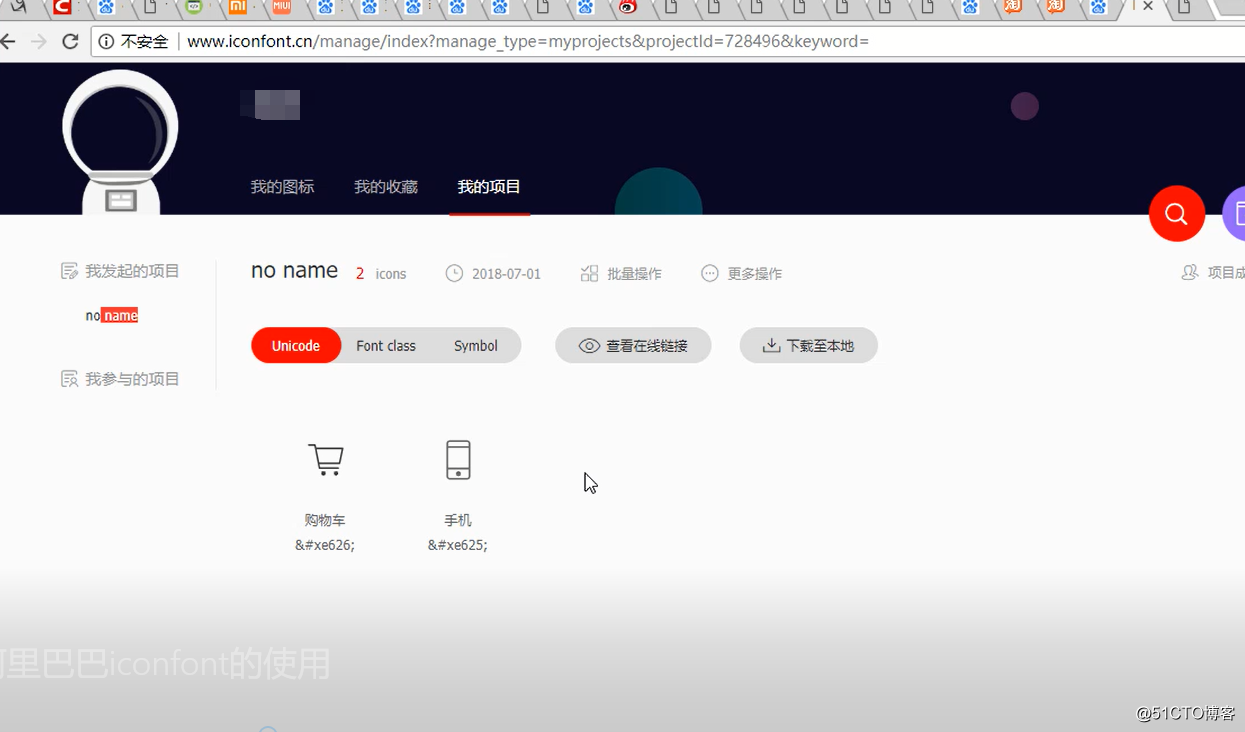
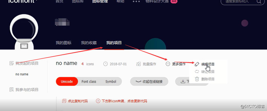
编写项目名称:
再到代码应用中去:
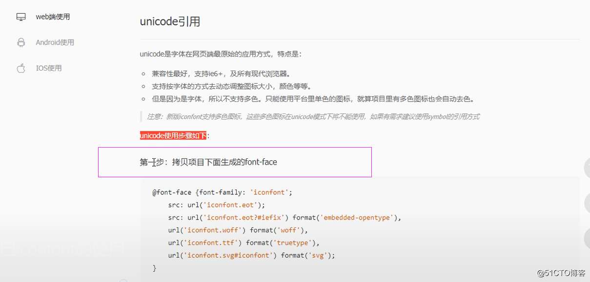
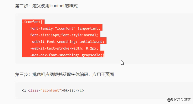
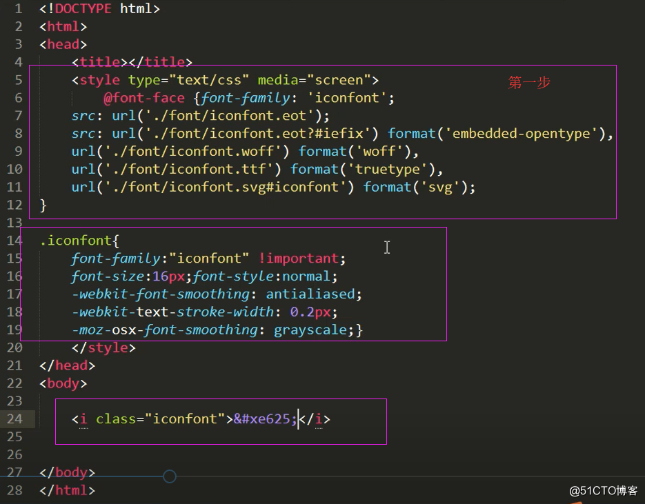
Unicode的引用:
将图片下载到本地:
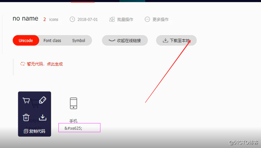
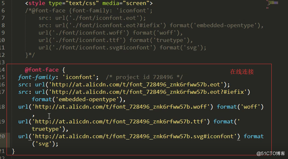
下载之后 解压到使用连接的目录下面:
上面的散步,不过要修改一下啊在前面加上./font目录去连接图片
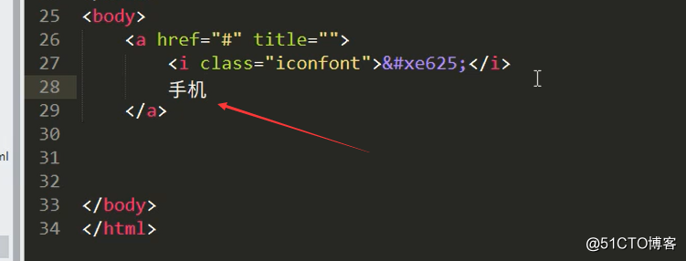
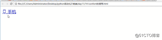
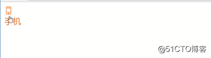
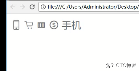
查看一下:
优化一下:
在一次优化
另外这里有在线连接,但是每次如果加了图片或者减少图片需要更新在线连接:
转载于:https://blog.51cto.com/xiaorenwutest/2136997
2)前端的css排版布局相关推荐
- web前端html+css常用布局05列表布局
web前端html+css常用布局05列表布局 注意:引入jquery的jquery-2.1.4.min.js包 图片从自己目录中路径. 代码: <!DOCTYPE html> <h ...
- 前端基础-CSS如何布局以及文档流,对于新手来说,特别有用
一. 网页布局方式 1.什么是网页布局方式 布局可以理解为排版,我们所熟知的文本编辑类工具都有自己的排版方式 比如word,nodpad++等等 而网页的布局方式指的就是浏览器这款工具是如何对网页中的 ...
- 通过JS+DIV+CSS排版布局实现选项卡效果
2019独角兽企业重金招聘Python工程师标准>>> CSS介绍及布局特定 层叠样式表是一种用来表现HTML(标准通用标记语言的一个应用)或XML(标准通用标记语言的一个子集)等文 ...
- 前端设计-css网格布局的最佳实践
越来越常见的问题-现在人们正在使用css网格布局来生产-似乎是"最好的做法是什么?"这个问题的简短答案是使用规范中定义的布局方法.您选择使用的规范的特定部分,以及如何将网格与其他布 ...
- html5对代码自动排版,HTML5系列:通过JS+DIV+CSS排版布局实现选项卡效果
CSS介绍及布局特点 层叠样式表是一种用来表现HTML(标准通用标记语言的一个应用)或XML(标准通用标记语言的一个子集)等文件样式的计算机语言. CSS目前最新版本为CSS3,是能够真正做到网页表现 ...
- 前端 之 CSS页面布局
文章目录 盒子模型 盒子模型概念 盒子模型成员介绍 Float(浮动) 清除浮动 Clear overflow溢出属性 Positioning(定位) Static 定位 Fixed 定位 Relat ...
- 前端基础-CSS弹性布局
三.弹性布局 1.多栏布局 概念:实现多个栏目的布局,类似于报纸 示意图 a) 分栏显示–语法:column-count:值 取值:值是一个栏目的数量 <style type="tex ...
- [前端随笔][css] 弹性布局
说在前面 弹性布局,顾名思义就是有弹性,能够根据屏幕/当前空间大小自由伸缩的.使用弹性布局可以很好的适应各种尺寸的客户端. 关键代码 display:flex; 设定元素为弹性布局 <文档传送门 ...
- web前端html+css常用布局02
代码: <!DOCTYPE html> <html> <head lang="en"> <meta charset="U ...
最新文章
- 阿里云大数据计算服务MaxCompute(下篇)
- Docker中安装DB2的详细教程和DBVisualize的安装教程
- 基于主观感兴趣区域的视频编码实践
- Servlet之间的跳转
- 内存管理(ybtoj-二叉堆)
- Apache——Introduction
- set和map去重调用什么方法_你真的了解ES6的Set,WeakSet,Map和WeakMap吗?
- 办公室中有一台计算机连接打印机,办公室就一个打印机,怎么让多个电脑一起用...
- 开课吧学python靠谱吗-学设计?学Python?看看我的人生是如何开挂!!!
- python大家都是怎么学的_你们都是怎么学 Python 的?
- 尚硅谷SpringCloud Alibaba
- ISO50001认证辅导,ISO50001验厂优化所有流程中的能源性能,促进更高效的能源管理
- siamfc代码解读_分析SiamFC
- CentOS install btsync
- 矩阵操作(转置、相加、相乘)
- sslv3 poodle漏洞 检测解决方法
- mac算法c语言,MAC算法原理
- Halo CMS项目改成用Maven构建项目并打包成安装程序
- mysql带条件的插入语句
- 用bim建模和用传统的图纸有什么差别?什么bim软件能提高建模效率?