CSS_03_盒子模型
CSS 盒子模型
CSS 盒子模型(Box Model)
新人注意啦:所有HTML元素全部都可以看作盒子,
在CSS中,"box model"这一术语是用来设计和布局时使用的。
CSS盒模型本质上是一个盒子,封装周围的HTML元素,
盒子包括:边距margin,边框border,填充padding和实际内容content。
盒模型允许我们在其它元素和周围元素边框之间的空间放置元素???Excuse Me???
下面的图片说明了盒子模型(Box Model):
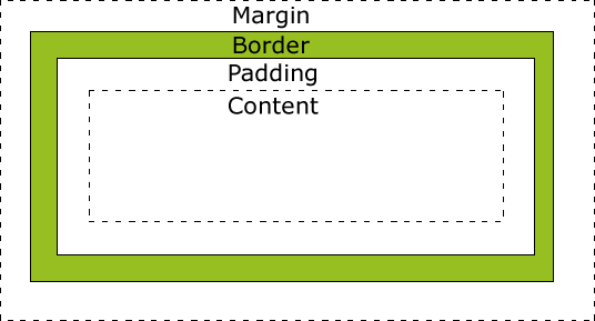
不同部分的说明:
- Margin(外边距) - 清除边框区域,注意了:Margin没有背景颜色,它是完全透明
- Border(边框) - 边框周围的填充和内容。边框是受到盒子的背景颜色影响
- Padding(内边距) - 清除内容的周围的区域。padding受到框中填充的背景颜色影响
- Content(内容) - 盒子的内容,显示文本和图像
为了在所有浏览器中的元素的宽度和高度设置正确的话,你需要知道的盒模型是如何工作的。
提示:在盒模型中,外边距margin可以是负值(-),而且在很多情况下都要使用负值(-)的外边距margin。
提示:参考下面这一段CSS盒子模型的内部结构可以让您了解更多的信息.
在CSS 3中,所有的页面元素都包含在一个矩形框内,称为盒子。
盒子描述了元素及其属性在页面布局中所占的空间大小。
在页面设计中有4个常见属性:content(内容)、padding(内边距)、border(边框)和margin(外边距),
我们把这4部分转化成日常生活的盒子来理解,所以称为盒子模型。
content(内容)就是盒子里装的东西,
padding(内边距)就是怕盒子里装的东西损坏而添加的泡沫或者其他抗震防挤压的辅料,
border(边框)就是盒子本身了,这个盒子是有一定的厚度的(即宽度),
margin(外边距)则说明盒子摆放的时候不能全部堆在一起,要留一定空隙???。
在网页设计中,content常指文字、图片等元素,但是也可以是小盒子(DIV嵌套),
padding只有宽度属性,可以理解为真实盒子中抗震辅料的厚度,因此绝对不能为负数,
而border有大小和颜色之分,又可以理解为真实盒子的厚度以及这个盒子的颜色或材料,
margin就是该盒子与其他东西要保留多大距离,但是比较特殊,margin可以为负数
如图所示:
从上图可以看出,盒子的概念不难理解,但是如果需要精确排版到像素级别,这就需要非常精确地理解其中的计算方法。
一个盒子实际所占有的宽度(或高度)是由“内容+内边距+边框+外边距”组成的。
在CSS中可以通过设置width和height的值来控制内容content所占矩形的大小,
并且对于任何一个盒子,都可以分别设定4条边各自的border、padding和margin,
如下图所示。因此只要利用好这些属性,才能够实现各种各样的排版效果。
元素的宽度和高度
 震惊:
震惊:
其实每当您指定一个CSS元素的宽度width和高度height属性时,
你只是设置内容区域content的宽度和高度。
如果想要知道元素的完全大小,你还必须添加填充padding,边框border和边距margin。
下面的例子中的元素的总宽度为300px:
padding:10px;
border:5px solid gray;
margin:10px;
让我们自己算算:
250px (宽)
+ 20px (左 + 右填充padding)
+ 10px (左 + 右边框border)
+ 20px (左 + 右边距margin)
= 300px
试想一下,你只有250像素的空间。让我们设置总宽度为250像素的元素:
实例
padding:10px;
border:5px solid gray;
margin:0px;
最终元素的总宽度计算公式是这样的:
总元素的宽度=内容宽度width+左填充+右填充+左边框+右边框+左边距+右边距
最终元素的总高度最终计算公式是这样的:
总元素的高度=内容高度height+顶部填充+底部填充+上边框+下边框+上边距+下边距.
代码如下:
<!DOCTPYE html>
<html lang="zh">
<head><link rel="icon" href="beyond.jpg" type="image/x-icon"/><meta charset="UTF-8"><meta name="author" content="beyond"><meta http-equiv="refresh" content="520"><meta name="description" content="免费零基础教程"><meta name="viewport" content="width=device-width, initial-scale=1.0, maximum-scale=1.0,minimum-scale=1.0,user-scalable=0" /><meta name="keywords" content="HTML,CSS,JAVASCRIPT"><title>beyondの心中の动漫神作</title><link rel="stylesheet" type="text/css" href="beyondbasestylewhite3.css"><!--[if lt IE 9]><script src="//apps.bdimg.com/libs/html5shiv/3.7/html5shiv.min.js"></script><![endif]--><style type="text/css">body{font-size: 100%;/*background-image: url("sakura4.png");background-repeat: no-repeat;background-position: center center;*/}/*这个牛X*/div.class_div {width: 220px;padding: 10px;border: 5px solid #aaa;margin: 0 auto;text-align: center;}</style>
</head><body><h1 style="color:white;text-shadow:2px 2px 4px #000;letter-spacing:5px;" class="sgcontentcolor sgcenter">未 闻 花 名</h1><img style="margin:0 auto;display:block;" src="menma.png" width="250" height="250" /><div class="class_div">上面的面码图片是250的宽,现在这个div也是250的总的宽度</div><p class="sgcontentcolor sgcenter"><b>注意:</b>这是盒子总宽(content+padding+border+margin)演示</p><footer id="copyright"><p style="font-size:14px;text-align:center;font-style:italic;">Copyright © <a id="author">2018</a> Powered by <a id="author">beyond</a></p><p><time pubdate datetime="2018-03-09" ></time></p></footer></body>
</html>
效果如下:
浏览器的兼容性问题
一旦为页面设置了恰当的 DTD,大多数浏览器都会按照上面的图示来呈现内容。
然而 IE 5 和 6 的呈现却是不正确的。
根据 W3C 的规范,元素内容content占据的空间是由 width 属性设置的,
而内容content周围的 padding 和 border 值是另外计算的。
不幸的是,IE5.X 和 6 在怪异模式中使用自己的非标准模型。
这些浏览器的 width 属性不是内容content的宽度,而是内容、内边距和边框的宽度的总和。
虽然有方法解决这个问题。但是目前最好的解决方案是回避这个问题。
也就是,不要给元素添加具有指定宽度的内边距,
而是尝试将内边距或外边距添加到元素的父元素和子元素???Excuse Me???
IE8 及更早IE版本不支持 填充(padding)的宽度和边框(border)的宽度属性。
解决IE8及更早版本不兼容问题可以在HTML页面声明 <!DOCTYPE html>即可。
CSS 边框
CSS 边框 (border) 可以是围绕元素内容和内边距的一条或多条线,
对于这些线条,您可以自定义它们的样式、宽度以及颜色。
使用CSS边框border属性,我们可以创建出比HTML中更加优秀的效果。
CSS 边框属性
CSS边框属性允许你指定一个元素各条边框的样式和颜色。
边框样式
边框样式属性指定要显示什么样的边界。
border-style属性用来定义边框的样式
border-style 值:
none: 默认无边框
dotted: 定义一个点线框
dashed: 定义一个虚线框
solid: 定义实线边界
double: 定义两个边界。 两个边界的宽度和border-width的值相同
groove: 定义3D沟槽边界。效果取决于边界的颜色值
ridge: 定义3D脊边界。效果取决于边界的颜色值
inset:定义一个3D的嵌入边框。效果取决于边界的颜色值
outset: 定义一个3D突出边框。 效果取决于边界的颜色值
.
下面代码演示了9种不同的边框样式:
代码如下:
<!DOCTPYE html>
<html lang="zh">
<head><link rel="icon" href="beyond.jpg" type="image/x-icon"/><meta charset="UTF-8"><meta name="author" content="beyond"><meta http-equiv="refresh" content="520"><meta name="description" content="免费零基础教程"><meta name="viewport" content="width=device-width, initial-scale=1.0, maximum-scale=1.0,minimum-scale=1.0,user-scalable=0" /><meta name="keywords" content="HTML,CSS,JAVASCRIPT"><title>beyondの心中の动漫神作</title><link rel="stylesheet" type="text/css" href="beyondbasestylewhite3.css"><!--[if lt IE 9]><script src="//apps.bdimg.com/libs/html5shiv/3.7/html5shiv.min.js"></script><![endif]--><style type="text/css">body{font-size: 100%;background-image: url("sakura4.png");background-repeat: no-repeat;background-position: center center;}</style>
</head><body><h1 style="color:white;text-shadow:2px 2px 4px #000;letter-spacing:5px;" class="sgcontentcolor sgcenter">未 闻 花 名</h1><p style="border-style:none;" class="sgcontentcolor sgcenter">无边框</p><p style="border-style:dotted;" class="sgcontentcolor sgcenter">dotted边框</p><p style="border-style:dashed;" class="sgcontentcolor sgcenter">dashed边框</p><p style="border-style:solid;" class="sgcontentcolor sgcenter">solid边框</p><p style="border-style:double;" class="sgcontentcolor sgcenter">double边框</p><p style="border-style:groove;" class="sgcontentcolor sgcenter">groove边框</p><p style="border-style:ridge;" class="sgcontentcolor sgcenter">ridge边框</p><p style="border-style:inset;" class="sgcontentcolor sgcenter">inset边框</p><p style="border-style:outset;" class="sgcontentcolor sgcenter">outset边框</p><p style="border-style:hidden;" class="sgcontentcolor sgcenter">hidden边框</p><p class="sgcontentcolor sgcenter"><b>注意:</b>这是<a style="color:red;">9种</a>border-style演示</p><footer id="copyright"><p style="font-size:14px;text-align:center;font-style:italic;">Copyright © <a id="author">2018</a> Powered by <a id="author">beyond</a></p><p><time pubdate datetime="2018-03-09" ></time></p></footer></body>
</html>
效果如下:
边框宽度 border-width
您可以通过 border-width 属性为边框指定宽度。
为边框指定宽度有两种方法:
1.可以指定具体的长度数值,比如 2px 或 0.1em;
2.或者使用 3 个关键字之一,它们分别是 thin 、medium(默认值) 和 thick。
注意:
CSS 没有定义 3 个关键字的具体宽度,
所以一个用户代理(浏览器)可能把 thin 、medium 和 thick 分别设置为等于 5px、3px 和 2px,
而另一个用户代理则分别设置为 3px、2px 和 1px.
代码如下:
<p style="border-style:solid;border-width:8px;" class="sgcontentcolor sgcenter">solid边框 8px</p><p style="border-style:solid;border-width:1px;" class="sgcontentcolor sgcenter">solid边框 1px</p><p style="border-style:solid;border-width:thick;" class="sgcontentcolor sgcenter">solid边框 thick</p><p style="border-style:solid;border-width:medium;" class="sgcontentcolor sgcenter">solid边框 medium</p><p style="border-style:solid;border-width:thin;" class="sgcontentcolor sgcenter">solid边框 thin</p><p class="sgcontentcolor sgcenter"><b>注意:</b>这是border-width必须与border-style同时设置</p>效果如下:
边框颜色 border-color
border-color属性用于设置边框的颜色,它一次可以接受最多4个颜色值。
可以设置的颜色格式有:
- name - 指定颜色的名称,如 "red"
- RGB - 指定 RGB 值, 如 "rgb(255,0,0)"
- Hex - 指定16进制值, 如 "#ff0000" 或 "#f00"
您还可以设置边框的颜色为"transparent"。
注意:
border-color单独使用是不起作用的,必须得先使用border-style来设置边框样式.
代码如下:
<p style="border-style:solid;border-color:red;" class="sgcontentcolor sgcenter">我们仍未知道那年夏天所见到的花的名字</p><p style="border-style:solid;border-color:#98bf21;" class="sgcontentcolor sgcenter">あの日見た花の名前を僕達はまだ知らない</p><p class="sgcontentcolor sgcenter"><b>注意:</b>border-color必须与border-style同时设置</p>效果如下:
边框-单独设置各边
在CSS中,可以指定不同的侧面不同的边框:
代码如下:
#id_p_anohana {border-top-style: dotted;border-right-style: dashed;border-bottom-style: solid;border-left-style: double;}效果如下:
上面的例子也可以设置一个单一属性:
实例
效果如下:
border-style属性可以有1-4个值:
- border-style:dotted solid double dashed;
- 上边框是 dotted
- 右边框是 solid
- 底边框是 double
- 左边框是 dashed
- border-style:dotted solid double;
- 上边框是 dotted
- 左、右边框是 solid
- 底边框是 double
- border-style:dotted solid;
- 上、底边框是 dotted
- 左、右边框是 solid
- border-style:dotted;
- 四面边框是 dotted
上面的例子用了border-style。
然而,它也可以和border-width 、 border-color一起使用。
透明边框
CSS2 引入了边框颜色值 transparent,这个值用于创建有宽度的不可见边框。
透明样式的定义如下:
a:link, a:visited {border-style: solid;border-width: 5px;border-color: transparent;text-decoration: none;}a:hover {text-decoration: underline;border-color: #bbb;}效果如下:
利用 transparent,使用边框就像是额外的内边距一样;
此外还有一个好处,就是能在你需要的时候使其可见。
这种透明边框相当于内边距,因为元素的背景(色)会延伸到边框的区域(如果有可见背景色的话)
如下图所示:
边框-简写属性 border
上面的例子用了很多属性来设置边框。
你也可以在一个简写属性中设置边框。
你可以在"border"属性中设置(顺序千万不能搞错!):
- border-width
- border-style (required)
- border-color
实例

更多实例
设置左边框的宽度
本例演示如何设置左边框的宽度。
代码如下:
p {
border-style:solid;
border-left-width:15px;
}
效果如下:
设置四个边框的颜色
本例演示如何设置四个边框的颜色。可以设置1到4个颜色。
代码如下:
<style type="text/css">body{font-size: 100%;background-image: url("sakura4.png");background-repeat: no-repeat;background-position: center center;}p.onecolor {border-style: solid;border-color: #f00;}p.twocolor {border-style: solid;border-color: #f00 #0f0;}p.threecolor {border-style: solid;border-color: #f00 #0f0 #00f;}p.fourcolor {border-style: solid;border-color: #f00 #0f0 #00f #000;}</style>效果如下:
CSS 边框属性
| 属性 | 描述 |
|---|---|
| border | 简写属性,用于把针对四个边的属性设置在一个声明。 |
| border-style | 用于设置元素所有边框的样式,或者单独地为各边设置边框样式。 |
| border-width | 简写属性,用于为元素的所有边框设置宽度,或者单独地为各边边框设置宽度。 |
| border-color | 简写属性,设置元素的所有边框中可见部分的颜色,或为 4 个边分别设置颜色。 |
| border-bottom | 简写属性,用于把下边框的所有属性设置到一个声明中。 |
| border-bottom-color | 设置元素的下边框的颜色。 |
| border-bottom-style | 设置元素的下边框的样式。 |
| border-bottom-width | 设置元素的下边框的宽度。 |
| border-left | 简写属性,用于把左边框的所有属性设置到一个声明中。 |
| border-left-color | 设置元素的左边框的颜色。 |
| border-left-style | 设置元素的左边框的样式。 |
| border-left-width | 设置元素的左边框的宽度。 |
| border-right | 简写属性,用于把右边框的所有属性设置到一个声明中。 |
| border-right-color | 设置元素的右边框的颜色。 |
| border-right-style | 设置元素的右边框的样式。 |
| border-right-width | 设置元素的右边框的宽度。 |
| border-top | 简写属性,用于把上边框的所有属性设置到一个声明中。 |
| border-top-color | 设置元素的上边框的颜色。 |
| border-top-style | 设置元素的上边框的样式。 |
| border-top-width | 设置元素的上边框的宽度。 |
CSS Outlines
轮廓(outline)是绘制于元素外周围的一条线,位于边框边缘的外围,可起到突出元素的作用。
轮廓(outline)属性指定了样式、颜色和外边框的宽度。
轮廓(outline)属性的特殊位置让它不会像边框那样参与到文档流中去哈~
因此轮廓出现或消失那一刹那 永远都不会影响到文档流哈~也就是:不会导致文档的刷新啦~
轮廓(outline)实例
在元素周围画线
本例演示使用outline属性在元素周围画一条线。
代码如下:
p.oneoutline{border:1px solid red;outline: green dotted thick;}效果如下:
.
设置轮廓的样式
本例演示如何设置轮廓的样式。
代码如下:
<p style="outline-style:dotted" class="sgcenter">1.dotted outline</p><p style="outline-style:dashed" class="sgcenter"> 2. dashed outline</p><p style="outline-style:double" class="sgcenter">3. double outline</p><p style="outline-style:solid" class="sgcenter">4. solid outline</p><p style="outline-style:groove" class="sgcenter">5. groove outline</p><p style="outline-style:ridge" class="sgcenter">6. ridge outline</p><p style="outline-style:inset" class="sgcenter">7. inset outline</p><p style="outline-style:outset" class="sgcenter">8. outset outline</p>效果如下:
设置轮廓的颜色
本例演示如何设置轮廓的颜色。
代码如下:
p {border:1px solid red;outline-style: dotted;outline-color: #0f0;}效果如下:
设置轮廓的宽度
本例演示如何设置轮廓的宽度。
代码如下:
p {border:1px solid red;}p.outlineone{outline-style: solid;outline-width: thin;}p.outlinetwo {outline-style: solid;outline-width: 3px;}效果如下:
CSS 轮廓(outline)
轮廓(outline)是绘制于元素外周围的一条线,位于边框边缘的外围,可起到突出元素的作用。
CSS outline 属性规定元素轮廓的样式、颜色和宽度。

所有CSS 轮廓(outline)属性
"CSS" 列中的数字表示哪个CSS版本定义了该属性(CSS1 或者CSS2)。
| 属性 | 说明 | 值 | CSS |
|---|---|---|---|
| outline | 在一个声明中设置所有的外边框属性 |
outline-color outline-style outline-width inherit |
2 |
| outline-color | 设置外边框的颜色 |
color-name hex-number rgb-number invert inherit |
2 |
| outline-style | 设置外边框的样式 |
none dotted dashed solid double groove ridge inset outset inherit |
2 |
| outline-width | 设置外边框的宽度 |
thin medium thick length inherit |
2 |
CSS Margin(外边距)
CSS Margin(外边距)属性定义元素周围的空间。
CSS Margin属性接受任何长度单位、百分数值甚至负值。
Margin
margin清除周围的元素(外边框)的区域。
margin没有背景颜色,是完全透明的
margin可以单独改变元素的上,下,左,右边距。也可以一次改变所有的属性。
可能的值
| 值 | 说明 |
|---|---|
| auto |
设置浏览器边距。???Excuse Me??? 这样做的结果会依赖于浏览器 |
| length | 定义一个固定的margin(使用像素px,pt,em等) |
| % | 定义一个使用百分比的边距 |
Margin可以使用负值,重叠内容。
CSS Padding(填充)防压防震泡沫
CSS Padding(填充)属性定义元素边框border与元素内容content之间的空间。
Padding(填充)
当元素的 Padding(填充)(内边距)被清除时,所"释放"的区域将会受到元素背景颜色的填充。
单独使用填充属性可以改变上下左右的填充。缩写填充属性也可以使用,一旦改变一切都改变。
可能的值
| 值 | 说明 |
|---|---|
| length | 定义一个固定的填充(像素px, pt, em,等) |
| % | 使用百分比值定义一个填充 |
提示:CSS padding 属性可以使用长度值或百分比值,但与 margin 属性不同,它不允许使用负值。
内边距padding的百分比数值
CSS padding 属性的百分比数值是相对于其父元素的 width 计算的,
如果改变了父元素的 width,则它们也会改变。
以下是将段落的内边距设置为父元素 width 的 20% 的示例:
假设一个段落的父元素是 div 元素,那么它的 padding 的 width 计算是根据 div 进行的:
<p>This paragragh is contained within a DIV that has a width of 200 pixels.</p>
</div>
注意:上下内边距 与 左右内边距一致,
即上下内边距的百分数也是会相对于父元素宽度设置,而不是相对于高度。
填充- 单边内边距属性 (优先满足左padding???)
在CSS中,它可以指定不同的侧面不同的填充:
代码如下:
p {background-color: #ddd;padding-top: 25px;padding-bottom: 50px;padding-left: 30px;padding-right: 10px;}效果如下:
填充 - 简写属性
为了缩短代码,它可以在一个属性中指定的所有填充属性。
这就是所谓的缩写属性。所有的填充属性的缩写属性是"padding":
实例 (优先满足左padding)
效果如下:
Padding属性,可以有一到四个值。
padding:25px 50px 75px 100px;但是优先满足左padding
- 上填充为25px
- 右填充为50px
- 下填充为75px
- 左填充为100px
padding:25px 50px 75px;但是优先满足左padding
- 上填充为25px
- 左右填充为50px
- 下填充为75px
padding:25px 50px;但是优先满足左padding
- 上下填充为25px
- 左右填充为50px
padding:25px;
- 所有的填充都是25px,但是优先满足左padding
更多实例
在一个声明中的所有填充属性
这个例子演示了使用缩写属性设置在一个声明中的所有填充属性,可以有一到四个值。
设置左部填充
这个例子演示了如何设置元素左填充。
设置右部填充
这个例子演示了如何设置元素右填充。.
设置上部填充
这个例子演示了如何设置元素上填充。
设置下部填充
这个例子演示了如何设置元素下填充。
所有的CSS填充属性
| 属性 | 说明 |
|---|---|
| padding | 使用缩写属性设置在一个声明中的所有填充属性 |
| padding-bottom | 设置元素的底部填充 |
| padding-left | 设置元素的左部填充 |
| padding-right | 设置元素的右部填充 |
| padding-top | 设置元素的顶部填充 |
CSS 分组 和 嵌套 选择器
CSS 分组可以将具有相同样式的选择器进行分组,减少代码量。
CSS 嵌套适用于选择器内部的选择器的样式。
Grouping Selectors
在样式表中有很多具有相同样式的元素。
h1 {

        color:green;

        }

        h2 {

        color:green;

        }

        p {

        color:green;

        }
为了尽量减少代码,你可以使用分组选择器。
每个选择器用逗号分隔.
在下面的例子中,我们对以上代码使用分组选择器:
实例
{
color:green;
}
提示:您可以对任意多个选择器进行分组,CSS 对此没有任何限制。
嵌套选择器
它可能适用于选择器内部的选择器的样式。
在下面的例子,为所有p元素指定一个样式,为所有元素指定一个class="marked"的样式,
并仅用于class="标记",类内的p元素指定第三个样式
代码如下:
<!DOCTPYE html>
<html lang="zh">
<head><link rel="icon" href="beyond.jpg" type="image/x-icon"/><meta charset="UTF-8"><meta name="author" content="beyond"><meta http-equiv="refresh" content="520"><meta name="description" content="免费零基础教程"><meta name="viewport" content="width=device-width, initial-scale=1.0, maximum-scale=1.0,minimum-scale=1.0,user-scalable=0" /><meta name="keywords" content="HTML,CSS,JAVASCRIPT"><title>beyondの心中の动漫神作</title><link rel="stylesheet" type="text/css" href="beyondbasestylewhite3.css"><!--[if lt IE 9]><script src="//apps.bdimg.com/libs/html5shiv/3.7/html5shiv.min.js"></script><![endif]--><style type="text/css">body{font-size: 100%;background-image: url("sakura4.png");background-repeat: no-repeat;background-position: center center;}p {color: red;text-align: center;}.class_div {background-color: green;}/*拥有某个class的元素里面的p标签才符合*/.class_div p {color: white;}</style>
</head><body><h1 style="color:white;text-shadow:2px 2px 4px #000;letter-spacing:5px;" class="sgcontentcolor sgcenter">未 闻 花 名</h1><p>あの日見た花の名前を僕達はまだ知らない</p><div class="class_div"><p>这个是div中的p标签</p></div><p class="sgcontentcolor sgcenter"><b>注意:</b>这是嵌套样式の演示!</p><!-- <a style="color:red;"></a> --><footer id="copyright"><p style="font-size:14px;text-align:center;font-style:italic;">Copyright © <a id="author">2018</a> Powered by <a id="author">beyond</a></p></footer>
</body>
</html>
效果如下:
CSS 尺寸 (Dimension)
CSS 尺寸 (Dimension) 属性允许你控制元素的高度和宽度。同样,它允许你增加行间距。
更多实例
设置元素的高度
这个例子演示了如何设置不同元素的高度。
使用百分比设置图像的高度
这个例子演示了如何使用百分比值设置元素的高度。
使用像素值来设置元素的宽度
本例演示如何使用像素值来设置元素的宽度。
设置元素的最大高度
此示例演示如何设置元素的最大高度。
如果最大高底太小了,则文字会发生溢出,如下图所示:
代码如下:
<!DOCTPYE html>
<html lang="zh">
<head><link rel="icon" href="beyond.jpg" type="image/x-icon"/><meta charset="UTF-8"><meta name="author" content="beyond"><meta http-equiv="refresh" content="520"><meta name="description" content="免费零基础教程"><meta name="viewport" content="width=device-width, initial-scale=1.0, maximum-scale=1.0,minimum-scale=1.0,user-scalable=0" /><meta name="keywords" content="HTML,CSS,JAVASCRIPT"><title>beyondの心中の动漫神作</title><link rel="stylesheet" type="text/css" href="beyondbasestylewhite3.css"><!--[if lt IE 9]><script src="//apps.bdimg.com/libs/html5shiv/3.7/html5shiv.min.js"></script><![endif]--><style type="text/css">body{font-size: 100%;background-image: url("sakura4.png");background-repeat: no-repeat;background-position: center center;}/*演示很小的 max height*/.class_smallMaxHeight {max-height: 50px;background-color: orange;}</style>
</head><body><h1 style="color:white;text-shadow:2px 2px 4px #000;letter-spacing:5px;" class="sgcontentcolor sgcenter">未 闻 花 名</h1><p class="class_smallMaxHeight">这是很小的最大高度の演示!这是很小的最大高度の演示!这是很小的最大高度の演示!这是很小的最大高度の演示!这是很小的最大高度の演示!这是很小的最大高度の演示!这是很小的最大高度の演示!这是很小的最大高度の演示!这是很小的最大高度の演示!这是很小的最大高度の演示!这是很小的最大高度の演示!这是很小的最大高度の演示!这是很小的最大高度の演示!这是很小的最大高度の演示!这是很小的最大高度の演示!这是很小的最大高度の演示!这是很小的最大高度の演示!这是很小的最大高度の演示!</p><p class="sgcontentcolor sgcenter" style="color:red;"><b>注意:</b>这是很小的最大高度の演示!</p><!-- <a style="color:red;"></a> --><footer id="copyright"><p style="font-size:14px;text-align:center;font-style:italic;color:red;">Copyright © <a id="author">2018</a> Powered by <a id="author">beyond</a></p></footer>
</body>
</html>
效果如下:
使用百分比来设置元素的最大宽度
本例演示如何使用百分比值来设置元素的最大宽度。
设置元素的最低高度
此示例演示如何设置元素的最小高度。
代码如下:
<!DOCTPYE html>
<html lang="zh">
<head><link rel="icon" href="beyond.jpg" type="image/x-icon"/><meta charset="UTF-8"><meta name="author" content="beyond"><meta http-equiv="refresh" content="520"><meta name="description" content="免费零基础教程"><meta name="viewport" content="width=device-width, initial-scale=1.0, maximum-scale=1.0,minimum-scale=1.0,user-scalable=0" /><meta name="keywords" content="HTML,CSS,JAVASCRIPT"><title>beyondの心中の动漫神作</title><link rel="stylesheet" type="text/css" href="beyondbasestylewhite3.css"><!--[if lt IE 9]><script src="//apps.bdimg.com/libs/html5shiv/3.7/html5shiv.min.js"></script><![endif]--><style type="text/css">body{font-size: 100%;background-image: url("sakura4.png");background-repeat: no-repeat;background-position: center center;}/*演示很小的 max height*/.class_smallMaxHeight {min-height: 130px;background-color: orange;}</style>
</head><body><h1 style="color:white;text-shadow:2px 2px 4px #000;letter-spacing:5px;" class="sgcontentcolor sgcenter">未 闻 花 名</h1><p class="class_smallMaxHeight">这是很大的最小高度の演示!这是很大的最小高度の演示!</p><p class="sgcontentcolor sgcenter" style="color:red;"><b>注意:</b>这是很大的最小高度の演示!</p><!-- <a style="color:red;"></a> --><footer id="copyright"><p style="font-size:14px;text-align:center;font-style:italic;color:red;">Copyright © <a id="author">2018</a> Powered by <a id="author">beyond</a></p></footer>
</body>
</html>
效果如下:
使用像素值设置元素的最小宽度
这个例子演示了如何使用像素值设置元素的最小宽度。
所有CSS 尺寸 (Dimension)属性
| 属性 | 描述 |
|---|---|
| height | 设置元素的高度。 |
| line-height | 设置行高。 |
| max-height | 设置元素的最大高度。 |
| max-width | 设置元素的最大宽度。 |
| min-height | 设置元素的最小高度。 |
| min-width | 设置元素的最小宽度。 |
| width | 设置元素的宽度。 |
CSS Display(显示) 与 Visibility(可见性)
CSS display 属性和 visibility属性都可以用来隐藏某个元素,但是这两个属性有不同的定义,
display属性设置一个元素应如何显示,
visibility属性指定一个元素应可见还是隐藏(位置还在,只是不可见)。
隐藏元素 - display:none或visibility:hidden
隐藏一个元素可以通过把display属性设置为"none",
或把visibility属性设置为"hidden"。
但是请注意,这两种方法会产生截然不同的结果。
visibility:hidden只是隐藏某个元素,但隐藏的元素仍需占用与未隐藏之前一样的空间。
也就是说,该元素仅仅是被隐藏了,但仍然会影响布局。仍占着位置
实例
visibility的效果如下:
display:none可以彻底隐藏掉某个元素,并且隐藏的元素不会占用任何文档空间。
它会从这个二维空间中消失得无影无踪
也就是说,该元素不只是被隐藏了,而且它的存在也被抹掉了,它
该元素原本占用的空间也会从页面布局中消失。
实例
CSS Display - 块和内联元素
block块元素 占用了一行的全部宽度,在它前后全都是换行符。
block块元素的例子:
- <h1>
- <p>
- <div>
inline内联元素只需要必要的最小的宽度,前面没有换行符。
inline内联元素的例子:
- <span>
- <a>
如何改变一个元素显示
可以更改内联inline元素 为 块block元素,反之亦然,
可以使页面看起来是以一种特定的方式组合,并仍然遵循web标准。
下面的示例把列表项显示为内联元素:
实例
完整代码如下:
<!DOCTPYE html>
<html lang="zh">
<head><link rel="icon" href="beyond.jpg" type="image/x-icon"/><meta charset="UTF-8"><meta name="author" content="beyond"><meta http-equiv="refresh" content="520"><meta name="description" content="免费零基础教程"><meta name="viewport" content="width=device-width, initial-scale=1.0, maximum-scale=1.0,minimum-scale=1.0,user-scalable=0" /><meta name="keywords" content="HTML,CSS,JAVASCRIPT"><title>beyondの心中の动漫神作</title><link rel="stylesheet" type="text/css" href="beyondbasestylewhite3.css"><!--[if lt IE 9]><script src="//apps.bdimg.com/libs/html5shiv/3.7/html5shiv.min.js"></script><![endif]--><style type="text/css">body{font-size: 100%;background-image: url("sakura4.png");background-repeat: no-repeat;background-position: center center;}/*将块元素改成inline*/li {display: inline;}</style>
</head><body><h1 style="color:white;text-shadow:2px 2px 4px #000;letter-spacing:5px;" class="sgcontentcolor sgcenter">未 闻 花 名</h1><ul style="text-align:center;padding-left:0px;"><li><a href="">那朵花</a></li><li><a href="">龙与虎</a></li><li><a href="">石头门</a></li></ul><p class="sgcontentcolor sgcenter"><b>注意:</b>可以将block元素改成inline</p><!-- <a style="color:red;"></a> --><footer id="copyright"><p style="font-size:14px;text-align:center;font-style:italic;">Copyright © <a id="author">2018</a> Powered by <a id="author">beyond</a></p></footer>
</body>
</html>
效果如下:
下面的示例把span元素作为块元素:
实例
完整代码如下:
<!DOCTPYE html>
<html lang="zh">
<head><link rel="icon" href="beyond.jpg" type="image/x-icon"/><meta charset="UTF-8"><meta name="author" content="beyond"><meta http-equiv="refresh" content="520"><meta name="description" content="免费零基础教程"><meta name="viewport" content="width=device-width, initial-scale=1.0, maximum-scale=1.0,minimum-scale=1.0,user-scalable=0" /><meta name="keywords" content="HTML,CSS,JAVASCRIPT"><title>beyondの心中の动漫神作</title><link rel="stylesheet" type="text/css" href="beyondbasestylewhite3.css"><!--[if lt IE 9]><script src="//apps.bdimg.com/libs/html5shiv/3.7/html5shiv.min.js"></script><![endif]--><style type="text/css">body{font-size: 100%;background-image: url("sakura4.png");background-repeat: no-repeat;background-position: center center;}/*将inline元素改成块*/span {display: block;}</style>
</head><body><h1 style="color:white;text-shadow:2px 2px 4px #000;letter-spacing:5px;" class="sgcontentcolor sgcenter">未 闻 花 名</h1><p class="sgcenter">我的后面是span<span>我是span</span>我的前面是span</p><p class="sgcontentcolor sgcenter"><b>注意:</b>可以将inline元素改成block</p><!-- <a style="color:red;"></a> --><footer id="copyright"><p style="font-size:14px;text-align:center;font-style:italic;">Copyright © <a id="author">2018</a> Powered by <a id="author">beyond</a></p></footer>
</body>
</html>
效果如下:
注意:变更元素的显示类型看该元素是如何显示,它是什么样的元素。例如:一个内联元素设置为display:block是不允许有它内部的嵌套块元素。
更多实例
如何使用一个表的collapse属性。
这个例子演示了如何使用表的collapse属性。
代码如下:
<!DOCTPYE html>
<html lang="zh">
<head><link rel="icon" href="beyond.jpg" type="image/x-icon"/><meta charset="UTF-8"><meta name="author" content="beyond"><meta http-equiv="refresh" content="520"><meta name="description" content="免费零基础教程"><meta name="viewport" content="width=device-width, initial-scale=1.0, maximum-scale=1.0,minimum-scale=1.0,user-scalable=0" /><meta name="keywords" content="HTML,CSS,JAVASCRIPT"><title>beyondの心中の动漫神作</title><link rel="stylesheet" type="text/css" href="beyondbasestylewhite3.css"><!--[if lt IE 9]><script src="//apps.bdimg.com/libs/html5shiv/3.7/html5shiv.min.js"></script><![endif]--><style type="text/css">body{font-size: 100%;background-image: url("sakura4.png");background-repeat: no-repeat;background-position: center center;}</style>
</head><body><h1 style="color:white;text-shadow:2px 2px 4px #000;letter-spacing:5px;" class="sgcontentcolor sgcenter">未 闻 花 名</h1><table border="1" style="margin:0 auto;text-align:center;"><tr><td>面码</td><td>15岁</td><td>AA罩杯</td></tr><tr style="visibility:collapse;"><td>逢坂大河</td><td>16岁</td><td>A罩杯</td></tr></table><p class="sgcontentcolor sgcenter"><b>注意:</b>表格行的visibility设置成collapse的话,将不可见</p><!-- <a style="color:red;"></a> --><footer id="copyright"><p style="font-size:14px;text-align:center;font-style:italic;">Copyright © <a id="author">2018</a> Powered by <a id="author">beyond</a></p></footer>
</body>
</html>
效果如下:
CSS Positioning(定位)
CSS position 属性,允许您将布局的一部分与另一部分重叠,
position属性,有四种不同的定位方法.
position 属性指定了元素的定位类型。
position 属性的四个值:
- static (默认的,也就是不定位,没定位,未定位)
- fixed(超脱文档流,不占文档空间)
- relative(相对于自己原来的位置进行偏移,常用作父容器)
- absolute(相对于已经有定位了的父元素)
元素可以使用的顶部,底部,左侧和右侧属性定位。
然而,这些属性默认是无法工作的,必须先设定一个position属性。(fixed或者relative或者absolute)
定位有时很棘手!
HTML元素的默认的值,即没有定位,元素出现在正常的流中。
静态static定位的元素中的top, bottom, left, right不会起作用 (因为没有定位position)
Fixed 定位
元素的位置相对于浏览器窗口是固定位置。
即使窗口是滚动的它也不会移动:
实例
{
position:fixed;
top:30px;
right:5px;
}
完整代码如下:
<!DOCTPYE html>
<html lang="zh">
<head><link rel="icon" href="beyond.jpg" type="image/x-icon"/><meta charset="UTF-8"><meta name="author" content="beyond"><meta http-equiv="refresh" content="520"><meta name="description" content="免费零基础教程"><meta name="viewport" content="width=device-width, initial-scale=1.0, maximum-scale=1.0,minimum-scale=1.0,user-scalable=0" /><meta name="keywords" content="HTML,CSS,JAVASCRIPT"><title>beyondの心中の动漫神作</title><link rel="stylesheet" type="text/css" href="beyondbasestylewhite3.css"><!--[if lt IE 9]><script src="//apps.bdimg.com/libs/html5shiv/3.7/html5shiv.min.js"></script><![endif]--><style type="text/css">body{font-size: 100%;background-image: url("sakura4.png");background-repeat: no-repeat;background-position: center center;}/*让图片固定在右上方,脱离文档流*/.class_img_fixed {position: fixed;top: 15px;right: 5px;}</style>
</head><body><h1 style="color:white;text-shadow:2px 2px 4px #000;letter-spacing:5px;" class="sgcontentcolor sgcenter">未 闻 花 名</h1><img class="class_img_fixed" src="jennifer.png" width="100" height="100" /><p class="sgcenter">あの日見た花の名前を僕達はまだ知らない</p> <p class="sgcenter">あの日見た花の名前を僕達はまだ知らない</p>  <p class="sgcenter">あの日見た花の名前を僕達はまだ知らない</p>  <p class="sgcenter">あの日見た花の名前を僕達はまだ知らない</p>  <p class="sgcenter">あの日見た花の名前を僕達はまだ知らない</p>  <p class="sgcenter">あの日見た花の名前を僕達はまだ知らない</p>  <p class="sgcenter">あの日見た花の名前を僕達はまだ知らない</p>  <p class="sgcenter">あの日見た花の名前を僕達はまだ知らない</p>  <p class="sgcenter">あの日見た花の名前を僕達はまだ知らない</p>  <p class="sgcontentcolor sgcenter"><b>注意:</b>图片的position设置为fixed那刻起,就脱离了文档流了</p><!-- <a style="color:red;"></a> --><footer id="copyright"><p style="font-size:14px;text-align:center;font-style:italic;">Copyright © <a id="author">2018</a> Powered by <a id="author">beyond</a></p></footer>
</body>
</html>
效果如下:
注意: Fixed 定位在 IE7 和 IE8 下需要描述 !DOCTYPE 才能支持.
Fixed定位的元素超脱文档流,使元素的位置与文档流无关,因此不占据空间。
Fixed定位的元素和其他元素重叠。
Relative 定位
相对定位元素的定位是相对其原来本身的正常位置,进行偏移的
代码如下:
<!DOCTPYE html>
<html lang="zh">
<head><link rel="icon" href="beyond.jpg" type="image/x-icon"/><meta charset="UTF-8"><meta name="author" content="beyond"><meta http-equiv="refresh" content="520"><meta name="description" content="免费零基础教程"><meta name="viewport" content="width=device-width, initial-scale=1.0, maximum-scale=1.0,minimum-scale=1.0,user-scalable=0" /><meta name="keywords" content="HTML,CSS,JAVASCRIPT"><title>beyondの心中の动漫神作</title><link rel="stylesheet" type="text/css" href="beyondbasestylewhite3.css"><!--[if lt IE 9]><script src="//apps.bdimg.com/libs/html5shiv/3.7/html5shiv.min.js"></script><![endif]--><style type="text/css">body{font-size: 100%;background-image: url("sakura4.png");background-repeat: no-repeat;background-position: center center;}/*relative是相对于自己本身原来的位置*/p.class_relative_left {position: relative;left: -80px;}p.class_relative_right {position: relative;left: 80px;}</style>
</head><body><h1 style="color:white;text-shadow:2px 2px 4px #000;letter-spacing:5px;" class="sgcontentcolor sgcenter">未 闻 花 名</h1><p class="sgcenter" style="background-color:red;color:white;">あの日見た花の名前を僕達はまだ知らない</p> <p class="sgcenter class_relative_left" style="background-color:red;color:white;">あの日見た花の名前を僕達はまだ知らない</p> <p class="sgcenter class_relative_right" style="background-color:red;color:white;">あの日見た花の名前を僕達はまだ知らない</p>    <p class="sgcontentcolor sgcenter"><b>注意:</b>relative是相对于自己本来的位置的<br/>relative常被用于absolute的父容器</p><!-- <a style="color:red;"></a> --><footer id="copyright"><p style="font-size:14px;text-align:center;font-style:italic;">Copyright © <a id="author">2018</a> Powered by <a id="author">beyond</a></p></footer>
</body>
</html>
效果如下:
就算移动的相对relative定位元素的内容,让它跟其他元素发生重叠,
它原来所占的空间依然不会发生任何改变.relative并不脱离文档流
代码如下:
<!DOCTPYE html>
<html lang="zh">
<head><link rel="icon" href="beyond.jpg" type="image/x-icon"/><meta charset="UTF-8"><meta name="author" content="beyond"><meta http-equiv="refresh" content="520"><meta name="description" content="免费零基础教程"><meta name="viewport" content="width=device-width, initial-scale=1.0, maximum-scale=1.0,minimum-scale=1.0,user-scalable=0" /><meta name="keywords" content="HTML,CSS,JAVASCRIPT"><title>beyondの心中の动漫神作</title><link rel="stylesheet" type="text/css" href="beyondbasestylewhite3.css"><!--[if lt IE 9]><script src="//apps.bdimg.com/libs/html5shiv/3.7/html5shiv.min.js"></script><![endif]--><style type="text/css">body{font-size: 100%;background-image: url("sakura4.png");background-repeat: no-repeat;background-position: center center;}/*relative是相对于自己本身原来的位置*/p.class_relative_top {position: relative;top: -33px;}</style>
</head><body><h1 style="color:white;text-shadow:2px 2px 4px #000;letter-spacing:5px;" class="sgcontentcolor sgcenter">未 闻 花 名</h1><p class="sgcenter class_relative_top" style="background-color:red;color:white;">あの日見た花の名前を僕達はまだ知らない</p>  <p class="sgcontentcolor sgcenter"><b>注意:</b>relative是相对于自己本来的位置的<br/>relative常被用于absolute的父容器<br/>relative虽然向上偏移,但依然占有位置,不脱离文档流</p><!-- <a style="color:red;"></a> --><footer id="copyright"><p style="font-size:14px;text-align:center;font-style:italic;">Copyright © <a id="author">2018</a> Powered by <a id="author">beyond</a></p></footer>
</body>
</html>
效果如下:
相对relative定位元素经常被用来作为绝对absolute定位元素的容器块。
Absolute 定位 与文档流无关,不占空间
绝对定位的元素的位置相对于最近的已定位父元素,如果元素没有已定位的父元素,那么它的位置相对于<html>:
这个父元素,常常是一个relative定位的元素:
实例
{
position:absolute;
left:100px;
top:150px;
}
代码如下:
<!DOCTPYE html>
<html lang="zh">
<head><link rel="icon" href="beyond.jpg" type="image/x-icon"/><meta charset="UTF-8"><meta name="author" content="beyond"><meta http-equiv="refresh" content="520"><meta name="description" content="免费零基础教程"><meta name="viewport" content="width=device-width, initial-scale=1.0, maximum-scale=1.0,minimum-scale=1.0,user-scalable=0" /><meta name="keywords" content="HTML,CSS,JAVASCRIPT"><title>beyondの心中の动漫神作</title><link rel="stylesheet" type="text/css" href="beyondbasestylewhite3.css"><!--[if lt IE 9]><script src="//apps.bdimg.com/libs/html5shiv/3.7/html5shiv.min.js"></script><![endif]--><style type="text/css">body{font-size: 100%;background-image: url("sakura4.png");background-repeat: no-repeat;background-position: center center;}/*absolute脱离了文档流*/p.class_absolute_top {position: absolute;top: 42px;}</style>
</head><body><h1 style="color:white;text-shadow:2px 2px 4px #000;letter-spacing:5px;" class="sgcontentcolor sgcenter">未 闻 花 名</h1><p class="sgcenter class_absolute_top" style="background-color:red;color:white;">あの日見た花の名前を僕達はまだ知らない</p>  <p class="sgcontentcolor sgcenter"><b>注意:</b>absolute定位的元素脱离文档流</p><!-- <a style="color:red;"></a> --><footer id="copyright"><p style="font-size:14px;text-align:center;font-style:italic;">Copyright © <a id="author">2018</a> Powered by <a id="author">beyond</a></p></footer>
</body>
</html>
效果如下:
Absolutely定位使元素的位置与文档流无关,因此不占空间。
Absolutely定位的元素和其他元素重叠。
重叠的元素
如果元素的定位与文档流无关,那么它们可以覆盖页面上的其它元素
z-index属性指定了一个元素的堆叠顺序(越大越放前面,越小越后面)
一个元素可以有正数或负数的堆叠顺序:
实例
{
position:absolute;
left:0px;
top:0px;
z-index:-1;
}
代码如下:
<!DOCTPYE html>
<html lang="zh">
<head><link rel="icon" href="beyond.jpg" type="image/x-icon"/><meta charset="UTF-8"><meta name="author" content="beyond"><meta http-equiv="refresh" content="520"><meta name="description" content="免费零基础教程"><meta name="viewport" content="width=device-width, initial-scale=1.0, maximum-scale=1.0,minimum-scale=1.0,user-scalable=0" /><meta name="keywords" content="HTML,CSS,JAVASCRIPT"><title>beyondの心中の动漫神作</title><link rel="stylesheet" type="text/css" href="beyondbasestylewhite3.css"><!--[if lt IE 9]><script src="//apps.bdimg.com/libs/html5shiv/3.7/html5shiv.min.js"></script><![endif]--><style type="text/css">body{font-size: 100%;back/*ground-image: url("sakura4.png");background-repeat: no-repeat;back*/ground-position: center center;}/*绝对定位脱离文档流*/img {position: absolute;left: 0px;top: 0px;z-index: -1;}</style>
</head><body><h1 style="color:white;text-shadow:2px 2px 4px #000;letter-spacing:5px;" class="sgcontentcolor sgcenter">未 闻 花 名</h1><img src="menma.png" width="150" height="150" /><p class="sgcenter" style="background-color:red;color:white;">あの日見た花の名前を僕達はまだ知らない</p>  <p class="sgcontentcolor sgcenter"><b>注意:</b>absolute定位的元素脱离文档流<br/>z-index越小越靠后</p><!-- <a style="color:red;"></a> --><footer id="copyright"><p style="font-size:14px;text-align:center;font-style:italic;">Copyright © <a id="author">2018</a> Powered by <a id="author">beyond</a></p></footer>
</body>
</html>
效果如下:
具有更高更大z-index的元素总是在较低的z-index元素的前面(上面)。
注意: 如果两个定位元素重叠,没有指定z - index,最后定位在HTML代码中的那个元素将被显示在最前面(上面)。
更多实例
裁剪元素的外形
此示例演示如何设置元素的外形。该元素被剪裁成这种形状,并显示出来。
clip的4个参数:
上边线(的y值),右边线(的x值),下边线(的y值),左边线(的x值)
代码如下:
<!DOCTPYE html>
<html lang="zh">
<head><link rel="icon" href="beyond.jpg" type="image/x-icon"/><meta charset="UTF-8"><meta name="author" content="beyond"><meta http-equiv="refresh" content="520"><meta name="description" content="免费零基础教程"><meta name="viewport" content="width=device-width, initial-scale=1.0, maximum-scale=1.0,minimum-scale=1.0,user-scalable=0" /><meta name="keywords" content="HTML,CSS,JAVASCRIPT"><title>beyondの心中の动漫神作</title><link rel="stylesheet" type="text/css" href="beyondbasestylewhite3.css"><!--[if lt IE 9]><script src="//apps.bdimg.com/libs/html5shiv/3.7/html5shiv.min.js"></script><![endif]--><style type="text/css">body{font-size: 100%;back/*ground-image: url("sakura4.png");background-repeat: no-repeat;back*/ground-position: center center;}/*绝对定位脱离文档流*/img {position: absolute;left: 0px;top: 0px;z-index: -1;/*clip的4个参数:上边线(的y值),右边线(的x值),下边线(的y值),左边线(的x值)*/clip: rect(6px,110px,130px,40px);}</style>
</head><body><h1 style="color:white;text-shadow:2px 2px 4px #000;letter-spacing:5px;" class="sgcontentcolor sgcenter">未 闻 花 名</h1><img src="menma.png" width="150" height="150" /><p class="sgcenter" style="background-color:red;color:white;">あの日見た花の名前を僕達はまだ知らない</p>  <p class="sgcontentcolor sgcenter"><b>注意:</b>clip的4个参数:<br/>上边线(的y值),右边线(的x值)<br/>下边线(的y值),左边线(的x值)</p><!-- <a style="color:red;"></a> --><footer id="copyright"><p style="font-size:14px;text-align:center;font-style:italic;">Copyright © <a id="author">2018</a> Powered by <a id="author">beyond</a></p></footer>
</body>
</html>
效果如下:
如何使用滚动条来显示元素内溢出的内容
这个例子演示了overflow属性创建一个滚动条,当一个元素的内容在指定的区域过大时如何设置以适应。
代码如下:
<!DOCTPYE html>
<html lang="zh">
<head><link rel="icon" href="beyond.jpg" type="image/x-icon"/><meta charset="UTF-8"><meta name="author" content="beyond"><meta http-equiv="refresh" content="520"><meta name="description" content="免费零基础教程"><meta name="viewport" content="width=device-width, initial-scale=1.0, maximum-scale=1.0,minimum-scale=1.0,user-scalable=0" /><meta name="keywords" content="HTML,CSS,JAVASCRIPT"><title>beyondの心中の动漫神作</title><link rel="stylesheet" type="text/css" href="beyondbasestylewhite3.css"><!--[if lt IE 9]><script src="//apps.bdimg.com/libs/html5shiv/3.7/html5shiv.min.js"></script><![endif]--><style type="text/css">body{font-size: 100%;back/*ground-image: url("sakura4.png");background-repeat: no-repeat;back*/ground-position: center center;}div.class_div_overflow_scroll {background-color: lightgray;width: 100px;height: 100px;overflow: scroll;margin: 0 auto;}div.class_div_overflow_hidden {background-color: #eee;width: 100px;height: 100px;overflow: hidden;margin: 0 auto;}</style>
</head><body><h1 style="color:white;text-shadow:2px 2px 4px #000;letter-spacing:5px;" class="sgcontentcolor sgcenter">未 闻 花 名</h1><div class="class_div_overflow_scroll">
在我们走过的季节里<br/>
路旁盛开的花朵也在不断变化<br/>
那个季节盛开的花是叫什么来着?<br/>
轻轻摇曳着,一碰会微微刺痛<br/>
靠近一闻,隐约有股青涩的阳光的气息<br/>
那气息渐渐地淡去,我们也在慢慢长大<br/>
可是,那朵花一定还在某个地方盛开着……<br/>
对,我们永远都会继续实现那朵花的愿望.</div> <div class="class_div_overflow_hidden">
私たちは大人になっていく<br/>
どんどん通り过ぎる季节に、<br/>
道端(みちばた)に咲く花も移り変わっていく<br/>
あの季节に咲いた花はなんて名前だったんだろう<br/>
小さく揺れて、触れればちくりと痛くて、<br/>
鼻を近づければ、わずかに青い日向(ひなた)の香りがした<br/>
次第にあの香りは薄れていく<br/>
俺たちは大人になっていく<br/>
だけど、あの花はきっとどこかに咲き続いてる<br/>
そうだ。俺たちは、いつまでもあの花の愿いを叶え続けてく<br/></div>  <p class="sgcontentcolor sgcenter"><b>注意:</b>overflow属性值hidden与scroll的演示</p><!-- <a style="color:red;"></a> --><footer id="copyright"><p style="font-size:14px;text-align:center;font-style:italic;">Copyright © <a id="author">2018</a> Powered by <a id="author">beyond</a></p></footer>
</body>
</html>
效果如下:
如何设置浏览器自动溢出处理
这个例子演示了如何设置浏览器来自动处理溢出。
代码如下:
<!DOCTPYE html>
<html lang="zh">
<head><link rel="icon" href="beyond.jpg" type="image/x-icon"/><meta charset="UTF-8"><meta name="author" content="beyond"><meta http-equiv="refresh" content="520"><meta name="description" content="免费零基础教程"><meta name="viewport" content="width=device-width, initial-scale=1.0, maximum-scale=1.0,minimum-scale=1.0,user-scalable=0" /><meta name="keywords" content="HTML,CSS,JAVASCRIPT"><title>beyondの心中の动漫神作</title><link rel="stylesheet" type="text/css" href="beyondbasestylewhite3.css"><!--[if lt IE 9]><script src="//apps.bdimg.com/libs/html5shiv/3.7/html5shiv.min.js"></script><![endif]--><style type="text/css">body{font-size: 100%;back/*ground-image: url("sakura4.png");background-repeat: no-repeat;back*/ground-position: center center;}div.class_div_overflow_auto {background-color: lightgray;width: 100px;height: 100px;overflow: auto;margin: 0 auto;}div.class_div_overflow_visible {background-color: #eee;width: 100px;height: 100px;overflow: visible;margin: 0 auto;}</style>
</head><body><h1 style="color:white;text-shadow:2px 2px 4px #000;letter-spacing:5px;" class="sgcontentcolor sgcenter">未 闻 花 名</h1><div class="class_div_overflow_auto">
在我们走过的季节里<br/>
路旁盛开的花朵也在不断变化<br/>
那个季节盛开的花是叫什么来着?<br/>
轻轻摇曳着,一碰会微微刺痛<br/>
靠近一闻,隐约有股青涩的阳光的气息<br/>
那气息渐渐地淡去,我们也在慢慢长大<br/>
可是,那朵花一定还在某个地方盛开着……<br/>
对,我们永远都会继续实现那朵花的愿望.</div> <br/><div class="class_div_overflow_visible">
私たちは大人になっていく<br/>
どんどん通り过ぎる季节に、
道端...</div>   <p class="sgcontentcolor sgcenter"><b>注意:</b>overflow属性值auto与visible的演示<br/>默认是visible</p><!-- <a style="color:red;"></a> --><footer id="copyright"><p style="font-size:14px;text-align:center;font-style:italic;">Copyright © <a id="author">2018</a> Powered by <a id="author">beyond</a></p></footer>
</body>
</html>
效果如下:
更改光标
这个例子演示了如何改变光标。
代码如下:
<!DOCTPYE html>
<html lang="zh">
<head><link rel="icon" href="beyond.jpg" type="image/x-icon"/><meta charset="UTF-8"><meta name="author" content="beyond"><meta http-equiv="refresh" content="520"><meta name="description" content="免费零基础教程"><meta name="viewport" content="width=device-width, initial-scale=1.0, maximum-scale=1.0,minimum-scale=1.0,user-scalable=0" /><meta name="keywords" content="HTML,CSS,JAVASCRIPT"><title>beyondの心中の动漫神作</title><link rel="stylesheet" type="text/css" href="beyondbasestylewhite3.css"><!--[if lt IE 9]><script src="//apps.bdimg.com/libs/html5shiv/3.7/html5shiv.min.js"></script><![endif]--><style type="text/css">body{font-size: 100%;back/*ground-image: url("sakura4.png");background-repeat: no-repeat;back*/ground-position: center center;}span {background-color: #eee;}</style>
</head><body><h1 style="color:white;text-shadow:2px 2px 4px #000;letter-spacing:5px;" class="sgcontentcolor sgcenter">未 闻 花 名</h1><span style="cursor:auto;">auto</span><span style="cursor:crosshair;">crosshair</span><span style="cursor:default;">default</span><span style="cursor:e-resize;">e-resize</span><span style="cursor:help;">help</span><span style="cursor:move;">move</span><span style="cursor:n-resize;">n-resize</span><br/><br/><span style="cursor:ne-resize;">ne-resize</span><span style="cursor:nw-resize;">nw-resize</span><span style="cursor:pointer;">pointer</span><span style="cursor:progress;">progress</span><span style="cursor:s-resize;">s-resize</span><span style="cursor:sw-resize;">sw-resize</span><br/><br/><span style="cursor:text;">text</span><span style="cursor:w-resize;">w-resize</span><span style="cursor:wait;">wait</span><p class="sgcontentcolor sgcenter"><b>注意:</b>cursor属性各种秀</p><!-- <a style="color:red;"></a> --><footer id="copyright"><p style="font-size:14px;text-align:center;font-style:italic;">Copyright © <a id="author">2018</a> Powered by <a id="author">beyond</a></p></footer>
</body>
</html>
效果如下:
所有的CSS定位属性
"CSS" 列中的数字表示哪个CSS(CSS1 或者CSS2)版本定义了该属性。
| 属性 | 说明 | 值 | CSS |
|---|---|---|---|
| bottom | 定义了定位元素下外边距边界与其包含块下边界之间的偏移。 |
auto length % inherit |
2 |
| clip | 剪辑一个绝对定位的元素 |
shape auto inherit |
2 |
| cursor | 显示光标移动到指定的类型 |
url auto crosshair default pointer move e-resize ne-resize nw-resize n-resize se-resize sw-resize s-resize w-resize text wait help |
2 |
| left | 定义了定位元素左外边距边界与其包含块左边界之间的偏移。 |
auto length % inherit |
2 |
| overflow | 设置当元素的内容溢出其区域时发生的事情。 |
auto hidden scroll visible inherit |
2 |
| position | 指定元素的定位类型 |
absolute fixed relative static inherit |
2 |
| right | 定义了定位元素右外边距边界与其包含块右边界之间的偏移。 |
auto length % inherit |
2 |
| top | 定义了一个定位元素的上外边距边界与其包含块上边界之间的偏移。 |
auto length % inherit |
2 |
| z-index | 设置元素的堆叠顺序 |
number auto inherit |
2 |
相关文章
CSS 参考手册:CSS position 属性
CSS Float(浮动)
CSS float 属性定义元素在哪个方向浮动,浮动元素会生成一个块级框,
直到该块级框的外边缘碰到包含框或者其他的浮动框为止。
什么是 CSS Float(浮动)?


CSS 的 Float(浮动),会使元素向左或向右移动,其周围的元素也会自动重新排列。
Float(浮动),往往是用于图像,但它在布局时一样非常有用。
元素怎样浮动
元素的水平方向浮动,意味着元素只能左右移动而不能上下移动。
一个浮动元素会尽量向左或向右移动,直到它的外边缘碰到包含框或另一个浮动框的边框为止。
浮动元素之后的元素将围绕它。
浮动元素之前的元素将不会受到影响。
如果图像是右浮动,下面的文本流将环绕在它左边
注意:p标签里有一张图和若干文本:
实例
{
float:right;
}
彼此相邻的浮动元素
如果你把几个浮动的元素放到一起,如果有空间的话,它们将彼此相邻。
在这里,我们对图片廊使用 float 属性:
代码如下:
<!DOCTPYE html>
<html lang="zh">
<head><link rel="icon" href="beyond.jpg" type="image/x-icon"/><meta charset="UTF-8"><meta name="author" content="beyond"><meta http-equiv="refresh" content="520"><meta name="description" content="免费零基础教程"><meta name="viewport" content="width=device-width, initial-scale=1.0, maximum-scale=1.0,minimum-scale=1.0,user-scalable=0" /><meta name="keywords" content="HTML,CSS,JAVASCRIPT"><title>beyondの心中の动漫神作</title><link rel="stylesheet" type="text/css" href="beyondbasestylewhite3.css"><!--[if lt IE 9]><script src="//apps.bdimg.com/libs/html5shiv/3.7/html5shiv.min.js"></script><![endif]--><style type="text/css">body{font-size: 100%;back/*ground-image: url("sakura4.png");background-repeat: no-repeat;back*/ground-position: center center;}.class_img_float {float: left;margin: 5px;}</style>
</head><body><h1 style="color:white;text-shadow:2px 2px 4px #000;letter-spacing:5px;" class="sgcontentcolor sgcenter">未 闻 花 名</h1><img class="class_img_float" src="menma.png" width="150" height="150" /><img class="class_img_float" src="mathilda.jpg" width="150" height="150" /><img class="class_img_float" src="jennifer.png" width="150" height="150" /><img class="class_img_float" src="bingguo.png" width="150" height="150" /><img class="class_img_float" src="hurutelika.png" width="150" height="150" /><img class="class_img_float" src="sakurashiro.png" width="150" height="150" /> <p class="sgcontentcolor sgcenter" style="clear:left;"><b>注意:</b>图片float属性是left</p><!-- <a style="color:red;"></a> --><footer id="copyright"><p style="font-size:14px;text-align:center;font-style:italic;">Copyright © <a id="author">2018</a> Powered by <a id="author">beyond</a></p></footer>
</body>
</html>
效果如下:
清除浮动 - 使用 clear属性
元素浮动之后,周围的元素会重新排列,有些元素不希望也跟着浮动,可使用 clear 属性。
clear 属性指定元素两侧不能出现浮动元素。
使用 clear 属性往文本中添加图片廊:
实例
{
clear:both;
}
提示:如果您想要了解更多有关 clear 属性的知识,请访问本站的CSS参考手册:CSS clear 属性。
更多实例
为图像添加边框和边距并浮动到段落的右侧
让我们为图像添加边框和边距并浮动到段落的右侧
代码如下:
<!DOCTPYE html>
<html lang="zh">
<head><link rel="icon" href="beyond.jpg" type="image/x-icon"/><meta charset="UTF-8"><meta name="author" content="beyond"><meta http-equiv="refresh" content="520"><meta name="description" content="免费零基础教程"><meta name="viewport" content="width=device-width, initial-scale=1.0, maximum-scale=1.0,minimum-scale=1.0,user-scalable=0" /><meta name="keywords" content="HTML,CSS,JAVASCRIPT"><title>beyondの心中の动漫神作</title><link rel="stylesheet" type="text/css" href="beyondbasestylewhite3.css"><!--[if lt IE 9]><script src="//apps.bdimg.com/libs/html5shiv/3.7/html5shiv.min.js"></script><![endif]--><style type="text/css">body{font-size: 100%;back/*ground-image: url("sakura4.png");background-repeat: no-repeat;back*/ground-position: center center;}.class_img_float {float: right;border: 1px dotted black;margin: 0px 0px 15px 20px;}</style>
</head><body><h1 style="color:white;text-shadow:2px 2px 4px #000;letter-spacing:5px;" class="sgcontentcolor sgcenter">未 闻 花 名</h1><p><img class="class_img_float" src="menma.png" width="150" height="150" />在我们走过的季节里,路旁盛开的花朵也在不断变化,那个季节盛开的花是叫什么来着?轻轻摇曳着,一碰会微微刺痛,靠近一闻,隐约有股青涩的阳光的气息。那气息渐渐地淡去,我们也在慢慢长大。可是,那朵花一定还在某个地方盛开着……对,我们永远都会继续实现那朵花的愿望。</p><p class="sgcontentcolor sgcenter" style="clear:left;"><b>注意:</b>图片float属性是right</p><!-- <a style="color:red;"></a> --><footer id="copyright"><p style="font-size:14px;text-align:center;font-style:italic;">Copyright © <a id="author">2018</a> Powered by <a id="author">beyond</a></p></footer>
</body>
</html>
效果如下:
标题和图片向右侧浮动
让标题和图片向右侧浮动。
代码如下:
<!DOCTPYE html>
<html lang="zh">
<head><link rel="icon" href="beyond.jpg" type="image/x-icon"/><meta charset="UTF-8"><meta name="author" content="beyond"><meta http-equiv="refresh" content="520"><meta name="description" content="免费零基础教程"><meta name="viewport" content="width=device-width, initial-scale=1.0, maximum-scale=1.0,minimum-scale=1.0,user-scalable=0" /><meta name="keywords" content="HTML,CSS,JAVASCRIPT"><title>beyondの心中の动漫神作</title><link rel="stylesheet" type="text/css" href="beyondbasestylewhite3.css"><!--[if lt IE 9]><script src="//apps.bdimg.com/libs/html5shiv/3.7/html5shiv.min.js"></script><![endif]--><style type="text/css">body{font-size: 100%;back/*ground-image: url("sakura4.png");background-repeat: no-repeat;back*/ground-position: center center;}.class_div_float {float: right;width: 170px;text-align: center;padding: 10px;border: 1px dotted black;margin: 0px 0px 15px 20px;}</style>
</head><body><h1 style="color:white;text-shadow:2px 2px 4px #000;letter-spacing:5px;" class="sgcontentcolor sgcenter">未 闻 花 名</h1><div class="class_div_float" ><img src="menma.png" width="150" height="150" />未闻花名</div><p>     在我们走过的季节里,路旁盛开的花朵也在不断变化,那个季节盛开的花是叫什么来着?轻轻摇曳着,一碰会微微刺痛,靠近一闻,隐约有股青涩的阳光的气息。那气息渐渐地淡去,我们也在慢慢长大。可是,那朵花一定还在某个地方盛开着……对,我们永远都会继续实现那朵花的愿望。</p><p class="sgcontentcolor sgcenter" style="clear:left;"><b>注意:</b>图片float属性是right</p><!-- <a style="color:red;"></a> --><footer id="copyright"><p style="font-size:14px;text-align:center;font-style:italic;">Copyright © <a id="author">2018</a> Powered by <a id="author">beyond</a></p></footer>
</body>
</html>
效果如下:
让段落的第一个字母浮动到左侧
改变样式,让段落的第一个字母浮动到左侧。
代码如下:
<!DOCTPYE html>
<html lang="zh">
<head><link rel="icon" href="beyond.jpg" type="image/x-icon"/><meta charset="UTF-8"><meta name="author" content="beyond"><meta http-equiv="refresh" content="520"><meta name="description" content="免费零基础教程"><meta name="viewport" content="width=device-width, initial-scale=1.0, maximum-scale=1.0,minimum-scale=1.0,user-scalable=0" /><meta name="keywords" content="HTML,CSS,JAVASCRIPT"><title>beyondの心中の动漫神作</title><link rel="stylesheet" type="text/css" href="beyondbasestylewhite3.css"><!--[if lt IE 9]><script src="//apps.bdimg.com/libs/html5shiv/3.7/html5shiv.min.js"></script><![endif]--><style type="text/css">body{font-size: 100%;back/*ground-image: url("sakura4.png");background-repeat: no-repeat;back*/ground-position: center center;}.class_div_float {float: right;width: 170px;text-align: center;padding: 10px;border: 1px dotted black;margin: 0px 0px 15px 20px;}/*段落首字符大号*/span {float: left;/*宽度变大,虽然字没变,但是与周围的空间变宽敞了*/width: 1.2em;font-size: 400%;font-family: algerian,courier;line-height: 80%;}</style>
</head><body><h1 style="color:white;text-shadow:2px 2px 4px #000;letter-spacing:5px;" class="sgcontentcolor sgcenter">未 闻 花 名</h1><div class="class_div_float" ><img src="menma.png" width="150" height="150" />未闻花名</div><p>     <span>在</span>我们走过的季节里,路旁盛开的花朵也在不断变化,那个季节盛开的花是叫什么来着?轻轻摇曳着,一碰会微微刺痛,靠近一闻,隐约有股青涩的阳光的气息。那气息渐渐地淡去,我们也在慢慢长大。可是,那朵花一定还在某个地方盛开着……对,我们永远都会继续实现那朵花的愿望。</p><p class="sgcontentcolor sgcenter" style="clear:left;"><b>注意:</b>图片float属性是right</p><!-- <a style="color:red;"></a> --><footer id="copyright"><p style="font-size:14px;text-align:center;font-style:italic;">Copyright © <a id="author">2018</a> Powered by <a id="author">beyond</a></p></footer>
</body>
</html>
效果如下:
创建一个没有表格的网页
使用 float 创建一个网页页眉、页脚、左边的内容和主要内容。
代码如下:
<!DOCTPYE html>
<html lang="zh">
<head><link rel="icon" href="beyond.jpg" type="image/x-icon"/><meta charset="UTF-8"><meta name="author" content="beyond"><meta http-equiv="refresh" content="520"><meta name="description" content="免费零基础教程"><meta name="viewport" content="width=device-width, initial-scale=1.0, maximum-scale=1.0,minimum-scale=1.0,user-scalable=0" /><meta name="keywords" content="HTML,CSS,JAVASCRIPT"><title>beyondの心中の动漫神作</title><link rel="stylesheet" type="text/css" href="beyondbasestylewhite3.css"><!--[if lt IE 9]><script src="//apps.bdimg.com/libs/html5shiv/3.7/html5shiv.min.js"></script><![endif]--><style type="text/css">body{font-size: 100%;back/*ground-image: url("sakura4.png");background-repeat: no-repeat;back*/ground-position: center center;}.class_div_container {width: 100%;margin: 0px;border:1px solid gray;}.class_div_header {margin: 0px;padding: 0.5em;background-color: green;clear: left;}.class_div_footer {padding: 0.5em;clear: left;background-color: rgba(222,222,222,0.3);}.class_div_left {float: left;width: 150px;margin: 0;padding: 1em;/*background-color: gray;*/}.class_div_content {margin-left: 190px;border-left: 1px solid gray;padding: 1em;}/*段落首字符大号*/span {float: left;/*宽度变大,虽然字没变,但是与周围的空间变宽敞了*/width: 1.2em;font-size: 400%;font-family: algerian,courier;line-height: 80%;}/*让图片标题一起右浮动*/.class_div_float {float: right;width: 170px;text-align: center;padding: 10px;border: 1px dotted black;margin: 0px 0px 0px 5px;}</style>
</head><body><div class="class_div_container"><div class="class_div_header"><h1 style="color:white;text-shadow:2px 2px 4px #000;letter-spacing:5px;" class="sgcontentcolor sgcenter">未 闻 花 名</h1></div><div class="class_div_left">这个是左边的菜单栏</div><div class="class_div_content"><div class="class_div_float" ><img src="menma.png" width="150" height="150" />未闻花名</div><p>      <span>在</span>我们走过的季节里,路旁盛开的花朵也在不断变化,那个季节盛开的花是叫什么来着?轻轻摇曳着,一碰会微微刺痛,靠近一闻,隐约有股青涩的阳光的气息。那气息渐渐地淡去,我们也在慢慢长大。可是,那朵花一定还在某个地方盛开着……对,我们永远都会继续实现那朵花的愿望。</p></div><div class="class_div_footer"><footer id="copyright"><p style="font-size:14px;text-align:center;font-style:italic;">Copyright © <a id="author">2018</a> Powered by <a id="author">beyond</a></p></footer></div>
</div>
</body>
</html>
效果如下:
CSS 中所有的浮动属性
"CSS" 列中的数字表示不同的 CSS 版本(CSS1 或 CSS2)定义了该属性。
| 属性 | 描述 | 值 | CSS |
|---|---|---|---|
| clear | 指定不允许元素周围有浮动元素。 |
left right both none inherit |
1 |
| float | 指定一个盒子(元素)是否可以浮动。 |
left right none inherit |
1 |
相关文章
CSS 参考手册:CSS float 属性
CSS 水平对齐(Horizontal Align)
关于 CSS 中元素的水平对齐(Horizontal Align),你可以使用多种属性来进行设置。
在CSS中,有几个属性用于元素水平对齐。
block块元素对齐
块元素是一个元素,占用了全宽,前后都是换行符。
块元素的例子:
- <h1>
- <p>
- <div>.
在这一章中,我们会告诉你块元素如何水平对齐布局margin:0 auto;
中心对齐,使用margin属性 margin:0 auto;
block块元素可以把左,右页边距设置为"auto自动"对齐。
Note: 在IE8中使用margin:auto属性无法正常工作,除非声明 !DOCTYPE
margin属性可任意拆分为左,右页边距设置自动指定,结果都是出现居中元素:
代码如下:
<!DOCTPYE html>
<html lang="zh">
<head><link rel="icon" href="beyond.jpg" type="image/x-icon"/><meta charset="UTF-8"><meta name="author" content="beyond"><meta http-equiv="refresh" content="520"><meta name="description" content="免费零基础教程"><meta name="viewport" content="width=device-width, initial-scale=1.0, maximum-scale=1.0,minimum-scale=1.0,user-scalable=0" /><meta name="keywords" content="HTML,CSS,JAVASCRIPT"><title>beyondの心中の动漫神作</title><link rel="stylesheet" type="text/css" href="beyondbasestylewhite3.css"><!--[if lt IE 9]><script src="//apps.bdimg.com/libs/html5shiv/3.7/html5shiv.min.js"></script><![endif]--><style type="text/css">body{font-size: 100%;background-image: url("sakura4.png");background-repeat: no-repeat;background-position: center center;}.class_div_center {margin: 0 auto;/*如果不把宽度压缩一点点,看不出水平居中效果喔*/width: 67%;background-color: rgba(202,202,202,0.2);}</style>
</head><body><h1 style="color:white;text-shadow:2px 2px 4px #000;letter-spacing:5px;" class="sgcontentcolor sgcenter">未 闻 花 名</h1><div class="class_div_center">     在我们走过的季节里,路旁盛开的花朵也在不断变化,那个季节盛开的花是叫什么来着?轻轻摇曳着,一碰会微微刺痛,靠近一闻,隐约有股青涩的阳光的气息。那气息渐渐地淡去,我们也在慢慢长大。可是,那朵花一定还在某个地方盛开着……对,我们永远都会继续实现那朵花的愿望。</div><p class="sgcontentcolor sgcenter" style="clear:left;"><b>注意:</b>block可通过margin:0 auto;进行水平居中</p><!-- <a style="color:red;"></a> --><footer id="copyright"><p style="font-size:14px;text-align:center;font-style:italic;">Copyright © <a id="author">2018</a> Powered by <a id="author">beyond</a></p></footer>
</body>
</html>
效果如下:
核心代码
{
margin-left:auto;
margin-right:auto;
width:70%;
background-color:#b0e0e6;
}
提示: 如果div的宽度是100%,水平居中是看不出来效果的。
注意:IE5中块元素有一个margin处理BUG。为了使上述例子能工作,在IE5中,需要添加一些额外的代码。
使用position属性设置block元素左/右对齐
元素对齐的方法之一是使用absolute绝对定位(超脱文档流):
经常使用一个relative元素作为absolute定位的父容器:
代码如下:
<!DOCTPYE html>
<html lang="zh">
<head><link rel="icon" href="beyond.jpg" type="image/x-icon"/><meta charset="UTF-8"><meta name="author" content="beyond"><meta http-equiv="refresh" content="520"><meta name="description" content="免费零基础教程"><meta name="viewport" content="width=device-width, initial-scale=1.0, maximum-scale=1.0,minimum-scale=1.0,user-scalable=0" /><meta name="keywords" content="HTML,CSS,JAVASCRIPT"><title>beyondの心中の动漫神作</title><link rel="stylesheet" type="text/css" href="beyondbasestylewhite3.css"><!--[if lt IE 9]><script src="//apps.bdimg.com/libs/html5shiv/3.7/html5shiv.min.js"></script><![endif]--><style type="text/css">body{font-size: 100%;background-image: url("sakura4.png");background-repeat: no-repeat;background-position: center center;}.class_div_right {/*绝对定位,脱离文档流,不占位置*/position: absolute;right: 0px;width: 300px;background-color: rgba(202,202,202,0.6);}</style>
</head><body><h1 style="color:white;text-shadow:2px 2px 4px #000;letter-spacing:5px;" class="sgcontentcolor sgcenter">未 闻 花 名</h1><div class="class_div_right">      在我们走过的季节里,路旁盛开的花朵也在不断变化,那个季节盛开的花是叫什么来着?轻轻摇曳着,一碰会微微刺痛,靠近一闻,隐约有股青涩的阳光的气息。那气息渐渐地淡去,我们也在慢慢长大。可是,那朵花一定还在某个地方盛开着……对,我们永远都会继续实现那朵花的愿望。</div><p class="sgcontentcolor sgcenter" style="clear:left;"><b>注意:</b>block可通过position为absolute进行水平居右</p><!-- <a style="color:red;"></a> --><footer id="copyright"><p style="font-size:14px;text-align:center;font-style:italic;">Copyright © <a id="author">2018</a> Powered by <a id="author">beyond</a></p></footer>
</body>
</html>
效果如下:
核心代码
{
position:absolute;
right:0px;
width:300px;
background-color:#b0e0e6;
}
注意:absolute绝对定位已经脱离了文档流,所以它会覆盖到页面上的其它元素(如图所示)。
Crossbrowser 兼容性问题
<p>类似这样的block元素在对齐时,预先就确定好margin和padding,这始终是一个好主意。
这是为了避免在不同的浏览器中的可视化差异。
IE8和早期有一个问题,当使用position属性时。
如果一个容器元素(在本例中<div class="container">)指定的宽度,
!DOCTYPE声明缺失的话,那么IE8和早期版本会在右边增添17px的margin。
这似乎是一个滚动条的预留空间
代码如下:
<!DOCTPYE html>
<html lang="zh">
<head><link rel="icon" href="beyond.jpg" type="image/x-icon"/><meta charset="UTF-8"><meta name="author" content="beyond"><meta http-equiv="refresh" content="520"><meta name="description" content="免费零基础教程"><meta name="viewport" content="width=device-width, initial-scale=1.0, maximum-scale=1.0,minimum-scale=1.0,user-scalable=0" /><meta name="keywords" content="HTML,CSS,JAVASCRIPT"><title>beyondの心中の动漫神作</title><link rel="stylesheet" type="text/css" href="beyondbasestylewhite3.css"><!--[if lt IE 9]><script src="//apps.bdimg.com/libs/html5shiv/3.7/html5shiv.min.js"></script><![endif]--><style type="text/css">body{font-size: 100%;background-image: url("sakura4.png");background-repeat: no-repeat;background-position: center center;/*声明margin和padding是个好习惯*/margin: 0;padding: 0;}.class_div_container {/*给绝对定位absolute作父容器*/position: relative;width: 100%;background-color: rgba(255,0,0,0.2);}.class_div_right {/*绝对定位,脱离文档流,不占位置*/position: absolute;right: 0px;/*相对于父容器container,因为父容器使用了relative进行设置了一下布局*/top: 30px;width: 300px;background-color: rgba(202,202,202,0.6);}</style>
</head><body><div class="class_div_container"><h1 style="color:white;text-shadow:2px 2px 4px #000;letter-spacing:5px;" class="sgcontentcolor sgcenter">未 闻 花 名</h1><div class="class_div_right">        在我们走过的季节里,路旁盛开的花朵也在不断变化,那个季节盛开的花是叫什么来着?轻轻摇曳着,一碰会微微刺痛,靠近一闻,隐约有股青涩的阳光的气息。那气息渐渐地淡去,我们也在慢慢长大。可是,那朵花一定还在某个地方盛开着……对,我们永远都会继续实现那朵花的愿望。</div><p class="sgcontentcolor sgcenter" style="clear:left;"><b>注意:</b>block可通过position为absolute进行水平居右</p><!-- <a style="color:red;"></a> --><footer id="copyright"><p style="font-size:14px;text-align:center;font-style:italic;">Copyright © <a id="author">2018</a> Powered by <a id="author">beyond</a></p>        </footer></div>
</body>
</html>
效果如下:
建议:在使用position属性时,请始终在页面顶部设置!DOCTYPE声明!
???Excuse Me???完全语句不通顺啊!!!
核心代码:
margin:0;
padding:0;
}
.container
{
position:relative;
width:100%;
}
.right
{
position:absolute;
right:0px;
width:300px;
background-color:#b0e0e6;
}
使用float属性设置左/右对齐
使用float属性是也是右对齐元素的方法之一喔
代码如下:
<!DOCTPYE html>
<html lang="zh">
<head><link rel="icon" href="beyond.jpg" type="image/x-icon"/><meta charset="UTF-8"><meta name="author" content="beyond"><meta http-equiv="refresh" content="520"><meta name="description" content="免费零基础教程"><meta name="viewport" content="width=device-width, initial-scale=1.0, maximum-scale=1.0,minimum-scale=1.0,user-scalable=0" /><meta name="keywords" content="HTML,CSS,JAVASCRIPT"><title>beyondの心中の动漫神作</title><link rel="stylesheet" type="text/css" href="beyondbasestylewhite3.css"><!--[if lt IE 9]><script src="//apps.bdimg.com/libs/html5shiv/3.7/html5shiv.min.js"></script><![endif]--><style type="text/css">body{font-size: 100%;background-image: url("sakura4.png");background-repeat: no-repeat;background-position: center center;/*声明margin和padding是个好习惯*/margin: 0;padding: 0;}.class_div_right {float: right;width: 300px;background-color: rgba(202,202,202,0.4);}</style>
</head><body><div class="class_div_container"><h1 style="color:white;text-shadow:2px 2px 4px #000;letter-spacing:5px;" class="sgcontentcolor sgcenter">未 闻 花 名</h1><div class="class_div_right">        在我们走过的季节里,路旁盛开的花朵也在不断变化,那个季节盛开的花是叫什么来着?轻轻摇曳着,一碰会微微刺痛,靠近一闻,隐约有股青涩的阳光的气息。那气息渐渐地淡去,我们也在慢慢长大。可是,那朵花一定还在某个地方盛开着……对,我们永远都会继续实现那朵花的愿望。</div><p class="sgcontentcolor sgcenter" style="clear:left;"><b>注意:</b>block可通过float为right进行水平居右</p><!-- <a style="color:red;"></a> --><footer id="copyright"><p style="font-size:14px;text-align:center;font-style:italic;">Copyright © <a id="author">2018</a> Powered by <a id="author">beyond</a></p>      </footer></div>
</body>
</html>
效果如下:
核心代码:
{
float:right;
width:300px;
background-color:#b0e0e6;
}
使用Padding设置垂直居中对齐
CSS 中一个简单的设置垂直居中对齐的方式就是头部顶部使用 padding:
如果要水平和垂直都居中,可以使用 padding 和 text-align: center:
Crossbrowser兼容性问题
类似这样的元素对齐时,预先确定margin和padding,始终是一个好主意。
这是为了避免在不同的浏览器中的可视化差异。
IE8和早期有一个问题,当使用float属性时。
如果给一个容器元素(在本例中<div class="container">)指定宽度时,
如果!DOCTYPE声明缺失的话,那会IE8和早期版本就会在右边增添17px的margin。
这似乎是一个滚动的预留空间。
因此,请注意:在使用float属性时,始终在页面顶部设置!DOCTYPE声明!
实例
{
margin:0;
padding:0;
}
.right
{
float:right;
width:300px;
background-color:#b0e0e6;
}
未完待续,下一章节,つづく
CSS_03_盒子模型相关推荐
- 创建一个水平盒子java_盒子模型理解
HTML CSS + DIV实现整体布局 1.技术目标: 开发符合W3C标准的Web页面 理解盒子模型 实现DIV+CSS整体布局 2.什么是W3C标准? W3C:World Wide Web Con ...
- 【Qt】Qt样式表总结(四):CSS盒子模型
官网:http://doc.qt.io/qt-5/stylesheet-customizing.html#box-model [Qt]Qt样式表总结(一):选择器 [Qt]Qt样式表总结(二):冲突和 ...
- CSS之布局(盒子模型--外边距)
盒子模型--外边距: <!DOCTYPE html> <html><head><meta charset="UTF-8"><t ...
- CSS之布局(盒子模型--内边距)
盒子模型--内边距: <!DOCTYPE html> <html><head><meta charset="UTF-8"><t ...
- CSS之布局(盒子模型—边框)
盒子模型-边框: <!DOCTYPE html> <html><head><meta charset="UTF-8"><tit ...
- 从条纹边框的实现谈盒子模型(转)
类似下面这个图形,只使用一个标签,可以有多少种实现方式: 假设我们的单标签为 div: 1 <div></div> 定义如下通用 CSS: 1 2 3 4 5 div{ ...
- CSS 盒子模型(转)
CSS中, Box Model叫盒子模型(或框模型),Box Model规定了元素框处理元素内容(element content).内边距(padding).边框(border) 和 外边距(marg ...
- CSS盒子模型(border、padding、margin、圆角边框、盒子阴影、文字阴影、新闻列表综合案例、新浪导航栏案例)
1. 网页布局的本质 首先利用CSS设置好盒子的大小,然后摆放盒子的位置. 最后把网页元素比如文字图片等等,放入盒子里面. 以上两步 就是网页布局的本质 2. 盒子模型(Box Model) 盒子模型 ...
- html盒子宽高,css盒子模型之宽度和高度
盒子模型的宽度width高度height;宽度和高度的单位px像素,使用%动态计算(自适应和响应式) HTML代码 *lt;div class="pag1">*lt;/div ...
最新文章
- “后浪95后”吴尚哲的 CVPR 最佳论文:无需任何监督,即可重建三维图像
- 如何使用Lombok来优雅的编码
- Android之Providing Resources(提供资源)
- 【计算机网络】TCP/IP模型
- 高通量数据分析必备|基因组浏览器使用介绍 - 1
- 《知识图谱》2020综述论文,18位作者, 130页pdf,547篇参考文献
- 一个箱子的梦想_长葛这中学“建”了一个“梦想厅”……
- ogg oracle 测试kafka_云MSP技本功|基于OGG 实现Oracle到Kafka增量数据实时同步
- 等压线上怎么画风向_如何利用等压线图判定天气
- matlab 插值多项式实现
- 点击右键头换到下一张图片html,简单的实现点击箭头图片切换的js代码
- linux 硬件raid 坏道,Linux服务器磁盘坏道的修复过程
- PDF编辑技巧 PDF怎么修改文字
- 接下来是 Downward API,它的作用是:让 Pod 里的容器能够直接获取到这个 Pod API 对象本身的信息。
- java 反射,根据类获取 属性名字和值
- 【日常技巧】小米手机投屏至win10笔记本
- 字节跳动安全AI挑战赛总结
- android CMWAP CMNET
- 解读智慧农业未来发展
- 针对电脑进行网络诊断显示“您可能需要与该网络的Internet服务提供商ISP签署协议才能获得访问Internet的权限”问题的解决方法