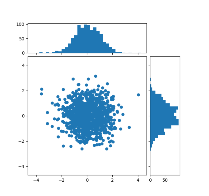
Scatter plot with histograms
Scatter plot with histograms
https://matplotlib.org/stable/gallery/lines_bars_and_markers/scatter_hist.html#sphx-glr-gallery-lines-bars-and-markers-scatter-hist-py
说白了就是搞三个subplot
Start with a square Figure.
fig = plt.figure(figsize=(6, 6))
Add a gridspec with two rows and two columns and a ratio of 1 to 4 between
the size of the marginal axes and the main axes in both directions.
Also adjust the subplot parameters for a square plot.
gs = fig.add_gridspec(2, 2, width_ratios=(4, 1), height_ratios=(1, 4), left=0.1, right=0.9, bottom=0.1, top=0.9, wspace=0.05, hspace=0.05)
Create the Axes.
ax = fig.add_subplot(gs[1, 0]) ax_histx = fig.add_subplot(gs[0, 0], sharex=ax) ax_histy = fig.add_subplot(gs[1, 1], sharey=ax)
Draw the scatter plot and marginals.
scatter_hist(x, y, ax, ax_histx, ax_histy)
Scatter plot with histograms相关推荐
- Python使用matplotlib可视化散点图、使用seaborn中的lmplot函数可视化不同分组散点图的最优线性回归拟合曲线(Scatter plot with regression line)
Python使用matplotlib可视化散点图.使用seaborn中的lmplot函数可视化不同分组散点图的最优线性回归拟合曲线(Scatter plot with linear regressio ...
- R语言ggplot2可视化散点图(scatter plot)、并在可视化图像的顶部和右边添加边缘直方图(Marginal Histogram)、使用geom_smooth函数基于lm方法拟合数据点之间
R语言ggplot2可视化散点图(scatter plot).并在可视化图像的顶部和右边添加边缘直方图(Marginal Histogram).使用geom_smooth函数基于lm方法拟合数据点之间 ...
- Python使用matplotlib可视化散点图、可视化两个数值变量之间的关系(Scatter plot)
Python使用matplotlib可视化散点图.可视化两个数值变量之间的关系(Scatter plot) 目录 Python使用matplotlib可视化散点图.可视化两个数值变量之间的关系(Sca
- Seaborn使用lmplot函数可视化散点图并添加回归曲线、移除默认的回归曲线置信区间(Scatter plot with regression line、Remove CI band)
Seaborn使用lmplot函数可视化散点图并添加回归曲线.移除默认的回归曲线置信区间(Scatter plot with regression line.Remove CI band) 目录
- R语言可视化散点图(scatter plot)图、为图中的部分数据点添加标签、ggrepel包来帮忙
R语言可视化散点图(scatter plot)图.为图中的部分数据点添加标签.ggrepel包来帮忙 目录
- R语言可视化散点图(scatter plot)、并在散点图中叠加回归曲线、叠加lowess拟合曲线(linear and lowess fit lines)、使用plot、line、abline函数
R语言可视化散点图(scatter plot).并在散点图中叠加回归曲线.叠加lowess拟合曲线(linear and lowess fit lines).使用plot函数.line函数和ablin ...
- R语言使用car包的scatter3d函数可视化可以交互旋转的3D散点图(Spinning 3D scatter plot by the scatter3d() function of car)
R语言使用car包的scatter3d函数可视化可以交互旋转的3D散点图(Spinning 3D scatter plot produced by the scatter3d() function i ...
- Seaborn使用regplot函数可视化散点图并添加回归曲线以及回归线对应的置信区间(Scatter plot with regression line)
Seaborn使用regplot函数可视化散点图并添加回归曲线以及回归线对应的置信区间(Scatter plot with regression line) 目录
- R语言ggplot2可视化使用ggplotly(plotly version of R)可视化散点图(scatter plot)
R语言ggplot2可视化使用ggplotly(plotly version of R)可视化散点图(scatter plot) 目录 R语言ggplot2可视化使用ggplotly(plotly v ...
最新文章
- 一些发现项目错误和改正的经历
- 游戏中反向运动学(ik)的研究与简介
- “云智一体“全场景智能视频技术与应用解析白皮书下载申请
- Shell脚本实现简单分割字符串
- HDR:为用户打造的视觉盛宴
- Redis 热点key
- 自学笔记:计时器Chronometer
- 配置CDI对话的超时
- 关于JSP表单的一些技巧和经验
- 移动app设计公司流程—APP设计需求分析规范
- 查看jdk版本号和安装目录
- 排错解决:etcd节点掉线后(code=exited, status=1/FAILURE),如何加入
- HTML特效代码大全(完整)
- 如何使用JavaWeb实现户籍管理系统?
- 灰色预测 Matlab
- Wireshark入门与进阶---Capture Options各项的含义与设定
- 鲲鹏鸿蒙概念股,华为鲲鹏概念新龙头股一览 华为鲲鹏概念股有哪些
- javascript处理日期和时间
- IEEE754标准表示浮点数(详解)
- EOS是什么以及含义
热门文章
- 22 Herschel(1850)和麦克斯韦(1860)的推导
- page_view页面访问——谷歌分析
- 2017年数据可视化的七大趋势!
- pandas使用merge函数将多个dataframe数据连接起来、设置how参数为left指定左连接(left join)、on参数指定连接字段
- [安全分析报告]门磁报警系统破解猜想
- Kong 运行报 Error: don‘t know how to auth: 10
- [词根词缀]bell/bio/brev/calc/cand/car的由来
- 老手机秒变监控器+监听器
- 【英语】你的努力不会白费——晨读总结
- 【致敬嵌入式攻城狮第2期活动预热征文】解决瑞萨RA2E1开发板在RT-Thread的版本中编译报错 error: ‘board_cfg.h‘ file not found